Personalise your home
e-Design allows users to customise their home in real-time 3D where users can choose from 10,000+ design options. It was one of the most challenging and most extended projects of my career. Clients were architects with a very detailed eye for the experience.
My role
I was part of this project right from the first sales meeting until delivery. As a lead UX Designer on an embedded team, I drove the experience design from sales to vision to execution. I collaborated with a product manager, business analyst, tech leads and QA's.
Responsibility
- Sell design as a capability
- Set the design direction for the design & team
- Planning of research and design delivery
- Research and design
- Drive ideation workshops and design showcases
- Manage design scope
- Monitor design delivery
Design team size
3 Designers
Tools
Pen & paper, excel, illustrator, sketch
Duration
14 months
Client
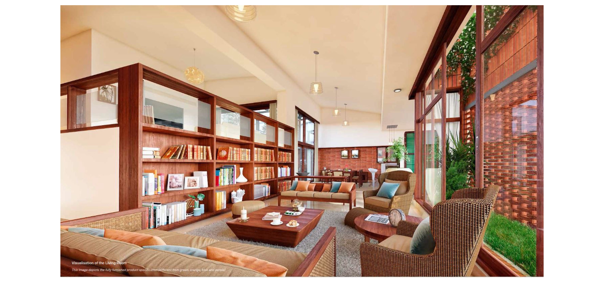
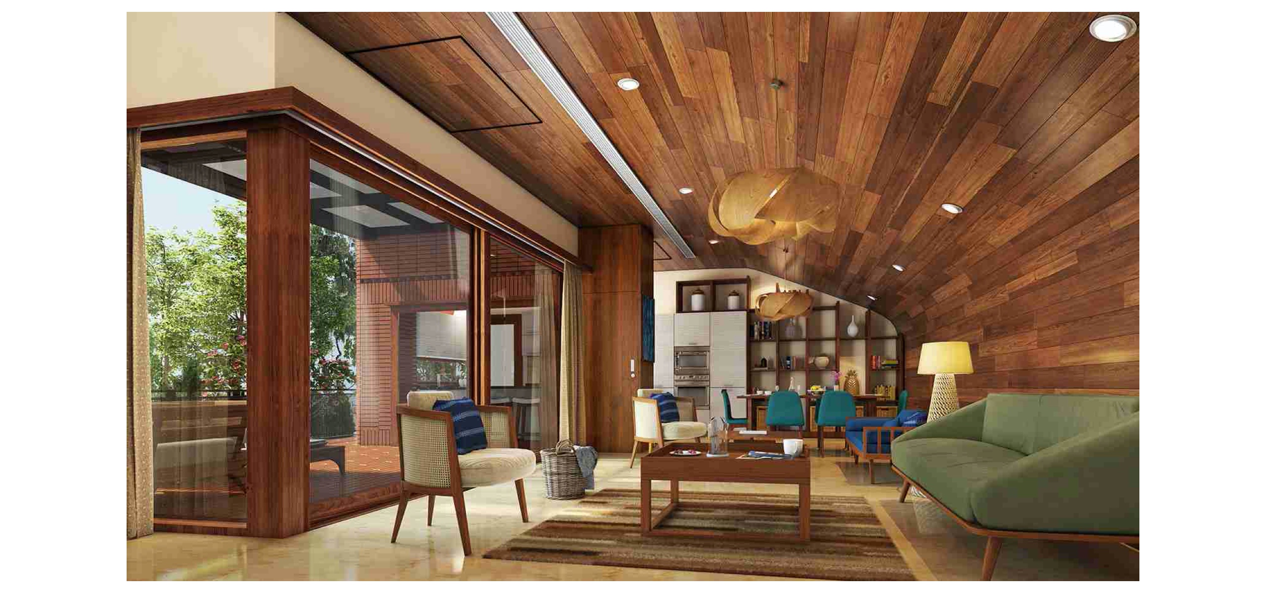
Total Environment (TE) is an award-winning design-led architectural firm. Their commitment to the craft of constructions and attention to details is legendary. Their classification system of construction materials is more detailed than industry standards. They allow their customers to customise their home using their product called ‘eDesign.’ eDesign enforced good design rules, so you can never choose a lousy design.
TE, as a brand isn’t just about construction; it is about delivering ‘priceless’ experiences. This taps into people’s desires for excitement and freedom. At the same time, TE focuses on craft and simplicity, which connects to people’s innate need for personal space and comfort.
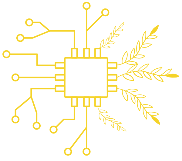
An artwork which I did for this product to show the fine balance between design and tech. Later my friend Dinker who was a product manager on this project wrote a book about product management and decided to use this as the book cover.
Problem statement -

Enable users to finish home customisation faster."
01. Understand___
Business - Users - Problems - Challagnes - Goals
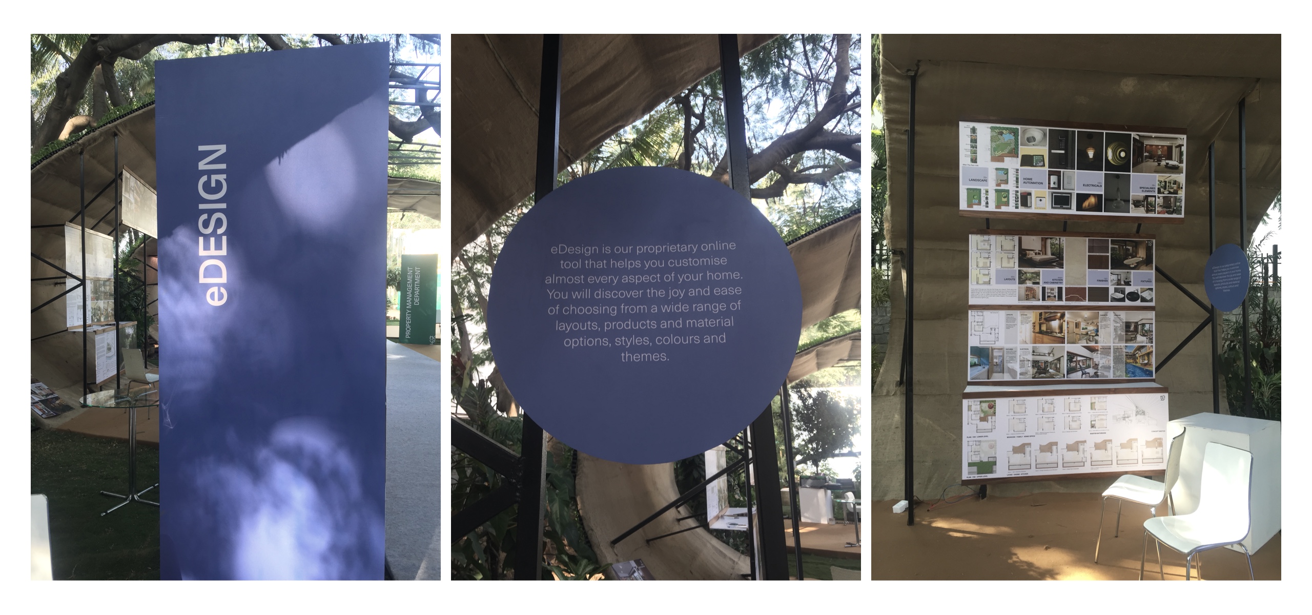
What is eDesign?
It’s an online proprietary tool that helps users to customise almost every aspect of their home. User can choose from a wide range of space layout options, styles, colours and themes. eDesign can even provide instant information on costs and feasibility. TE's in-house consultants will guide and assist users during the process.
The first and only version of eDesign went live in 2009. User can choose from a wide range of space layout options, fixtures, materials and appliances. Based on 2D images.
The first and only version of eDesign went live in 2009.
User can choose from a wide range of space layout options, fixtures, materials and appliances.
Based on 2D images.
The first and only version of eDesign went live in 2009.
Total 13 stages of customisation
The non-leaner flow of the application makes it hard to understand
Doesn't cover all needs and stages to customisation
Who are users?
Homebuyers - people who buy TE homes. Users will customise their home by using eDesign.
Exploration workshop
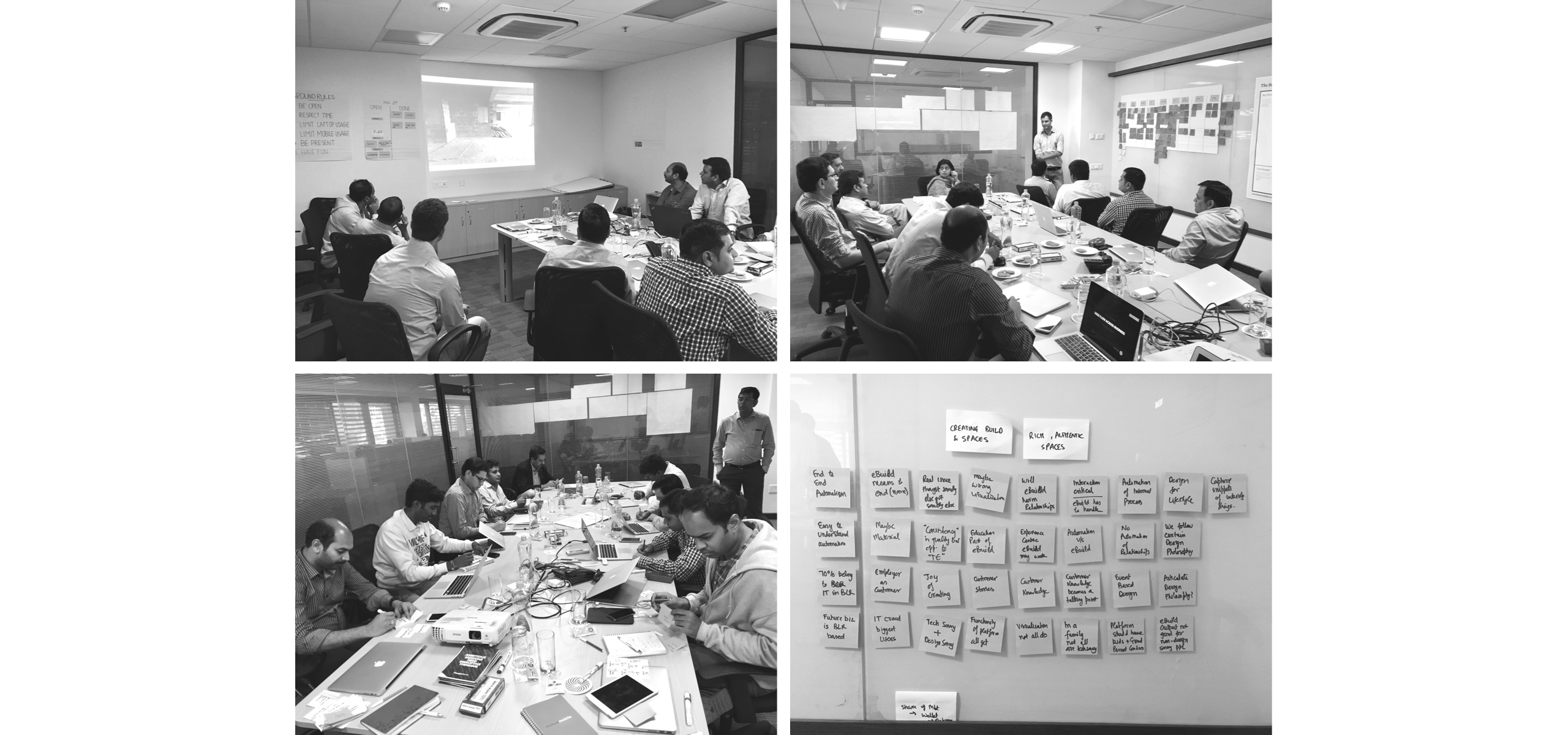
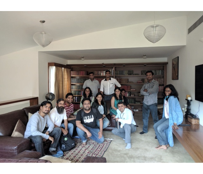
To start, I did a workshop with Total Environment’s founders, CIO, Technical team, Sales & Marketing, customisation experience managers and architects to understand complete eco-system, blockers, challenges and pain points.
Questions I wanted the answer for
- How does the business work?
- Why are we building this?
- What is the problem we want to solve?
- What does success look like? (for our customers, the business, etc…)
- Who is this for?
- What do they use this product/feature to accomplish?
- What is the scope of this project?
Big picture and scope
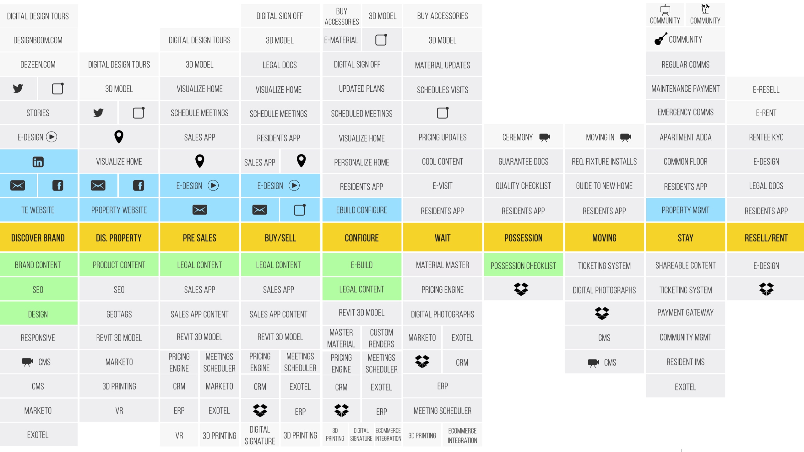
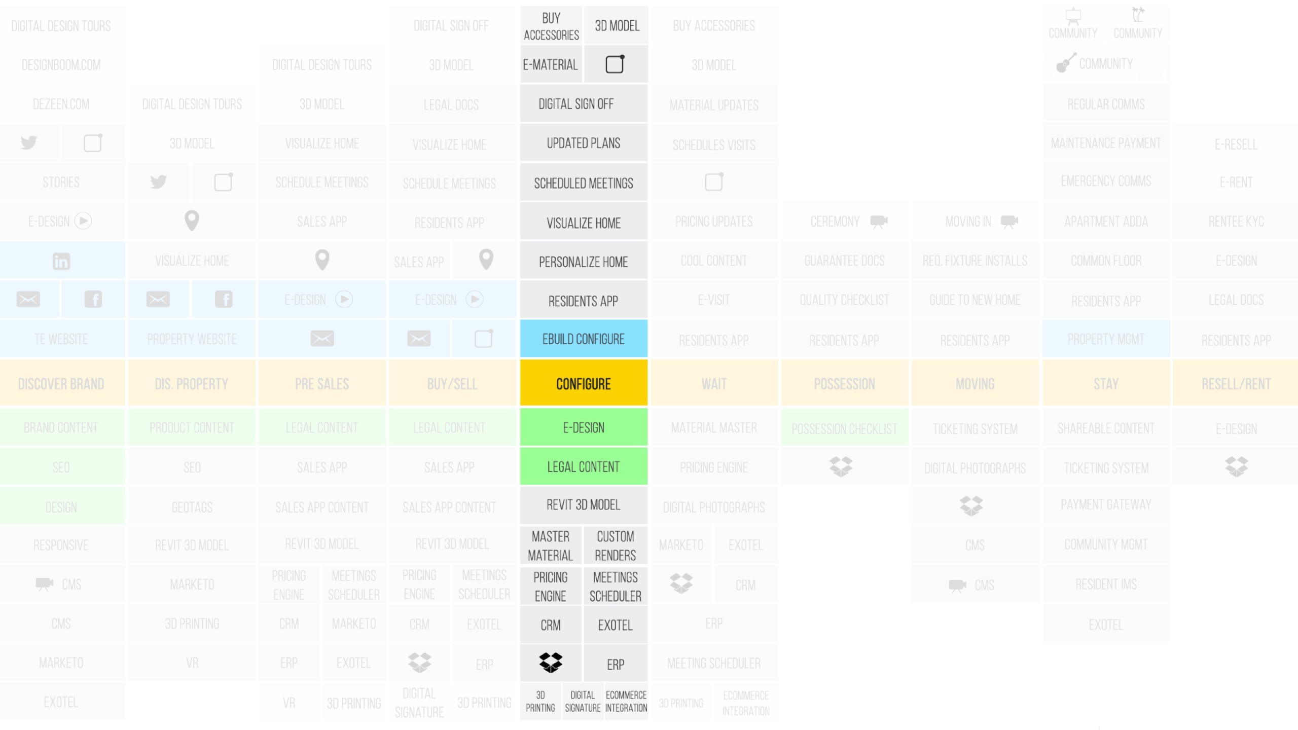
During the workshop, I captured the compete eco-system of a TE user and how they connect to the brand. Big picture covered the moment a user discovers the brand > buy > stay > sell/moveout of their TE property. What all stages they go through or touch and whare, and how eDesign fits. The current version used to cover only customisation stages, and this gave me an idea that eDesign should be a platform for TE users. Which means it should touch all stages and how it'll help users post customisations. The first step was to reimagine eDesign for customisation (configure) stage.
eDesign users
This product has 3 types of consumers (external and internal). Every consumer had their own goals and issues when it comes to dealing with the eDesign.
eDesign - product for homebuyers
It’s a proprietary online tool which helps users to customise almost every aspect of their home.
User can choose from a wide range of space layout options, styles, colours and themes.
e-Design provides instant information on costs and feasibility.
CEM’s - Customisation experience managers
- These are in-house experience managers who guide and assist users during the home customisation process.
- Every user is aligned with one CEM once a sales agreement is signed.
- CEM’s own the all touch-points during customisation and stay.
- They become the single POC for any customisation related needs.
- They are a bridge between users and architects in case of specific requirements.
Architects - e-Design design team
- Architects who work projects plans and home designs
- Validate designs for each unit type
- Work on a series of design options and push it into the system
User's touchpoints
Overall eDesign journey of a user and CEM’s and architects with touch-points
Challenges
This product has 3 types of consumers (external and internal). Every consumer had their own goals and issues when it comes to dealing with the eDesign.
eDesign (product for homebuyers)
- Not collaborative
- New design options and materials aren’t updated frequently
- 2d view - does not give good customisation experience
- Too many and confusing customisation stages
- Doesn’t show a big picture of the space
- Low customer satisfaction
- Largely dependent on manual work, so extremely error-prone
- Slow performance
CEM’s (Customisation experience managers)
- Each CEM manages around 40-50 customers in a month
- Hard to manage/track stages of customisation for each customer
- Change tracking for each customer
- Customise for users
- Exception tracking
- Coordinate between user and architects
Architects (e-Design design team)
- Largely dependent on manual work, so extremely error-prone
- Reduce development waste
- Each project was created again for the current system
- The system wasn’t scalable
- Hard to define global rules
- No global change
Business goals
Based on the workshop, we captured these goals for all stakeholders, which became a direction for the project.
e-Design
“Finish customisation faster”
CEM’s
“Personalised experience for buyers”
Architects
“We want to deliver faster”
02. User research___
Understand users - Home buying journey - Journey of a customisation - Customisation stages - Current product - Data
Understand every detail
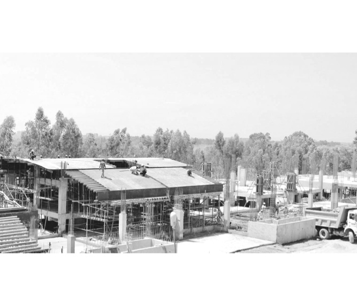
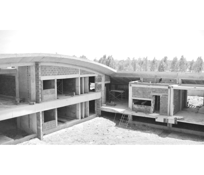
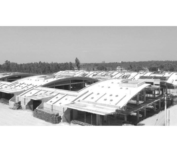
In order to understand how planning and construction work we visited construction sites, demo villas & apartments multiple times with sales and CEM’s to understand:
- Types of home layouts.
- Stages of construction and interiors
- Types of fixtures and how does CEM's recommend.
- Materials
- Components
- Landscape
- Offerings
- Observed customers who came for the site visit
Observational field study
I tried to match the system and the real world through multiple studies with the stakeholders and users. Also, To understand the complete journey of a buyer, we did a series of observation studies.
Workshops with sales and CEM’s
I did a series of workshops with sales/marketing and CEM teams to understand and discuss users perception about customisations, feedback about eDesign, pain points, complaints, issues, expectations and what do we communicate?
Sales meetings with buyers - diary study
Attended 7 sales meetings where I was observing how sales executives communicate with potential buyers, what and how do they explain customisation? What kind of questions users ask and how they react to personalisation.
Customisation meetings - diary study
I attended seven customisation sessions with users and CEM. In these users come with either special request, or they want to discuss in detail about a space customisation options. I was just sitting in those sessions and observing what users talk with CEM’s, what issues they bring up and how they approach for customisation.
Study current eDesign
Conducted series of workshops with CEM teams to understand current eDesign issues, what kind of questions do they get about eDesign. CEM provided an XLS (quantitative data) where they capture the variety of questions/issues they have been receiving from users. I grouped those that data into 5 categories (Navigation, content, presentation, interaction and underserved needs)
Study findings
eDesign
Users land in the system without any onboarding or guided navigation. The system gives the impression that it’s is a non-linear journey.
The system fails to provide how and where to start, which results in cognitive load.
The long learning curve for users
2d view design options and product images are low quality
Users can’t finish customisation without human intervention (CEM) because customisation like electrical needs CEM’s to be present as it’s an offline process.
The system doesn't provide price breakups, CEM’s shares separately.
eDesign customisation stages aren’t aligned with real-world communications.
Manual onboarding on eDesign by CEM's increases memory load on users.
Users get confused with multiple customisations stages
No help or customisation guide in the system
Users feel confused about dimensions.
The current system allows only one user at a time. It’s not a collaborative tool for families.
2D failed to give a real feel of the space
Doesn’t show a big picture of the space
The system doesn’t show any visual impacts which can communicate to users what and where they are compromising.
Mostly dependent on manual work, so extremely error-prone
Slow performance. It takes around 1 minute 8 seconds to load each design option
The system doesn’t allow users to buy movable furniture or furnishings.
Sales
- In all 6 sales meetings with potentials clients, I observed that every sales executive explains customisation differently.
- Too many customisation stages are hard to sell and confuses users.
- Sales executives aren’t entirely aware of what’s possible to customise what’s not.
- The sales team is aware that customisation is a market differentiator for them, but they lack detailed customisation knowledge.
- The team feels if they can gain full knowledge and can give live tool’s live demo will help in communicating value and will boost sales.
- They aren’t sure what to answer if users have special customisation request because they need to first check with CEM/architects about the feasibility.
- The way they explain customisation gives an impression that personalisation is a non-linear and non-sequential journey.
CEM (Customisation experience managers)
- 88% of users ask CEM's how and where to start customisation because the current system fails to guide them.
- 32% of users ask for personalised options
- Users prefer talking to CEM about design option instead of exploring in the system
- CEM's get request from the user about them sitting with the users while the user is doing customisation. Especially users who are abroad. One of the main reasons is that the system fails to guide the user
- They get lots of calls about what all can they customise what they can’t.
- Users ask CEM's to send movable furniture and furnishings catalogue because in all print and demo homes they see
- Most of the users are worried about how their space will look
- Electrical customisation is offline and eats up lots of time
- Average time to get drawing signoff is 8-14 days. Also, lots of users request CEM's to walk through the drawings before they signoff
- Users fail to understand the drawing set (output)
- Users want to see what materials will be used, and how will it look.
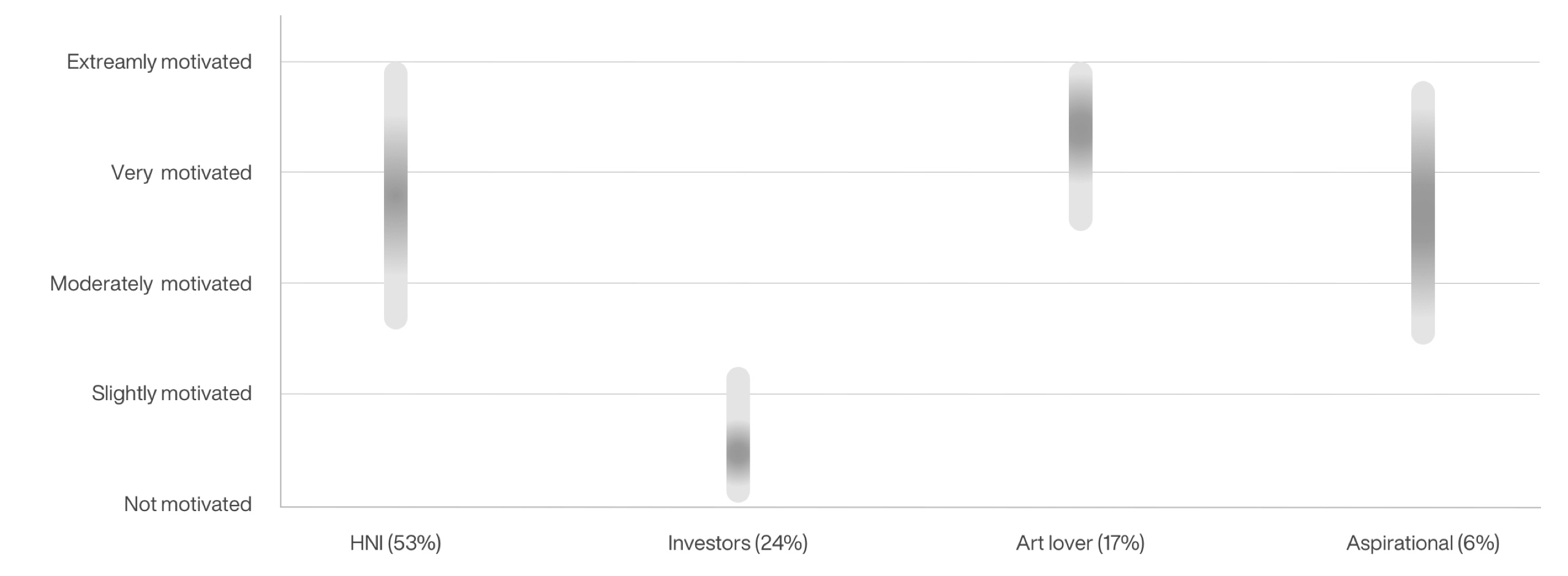
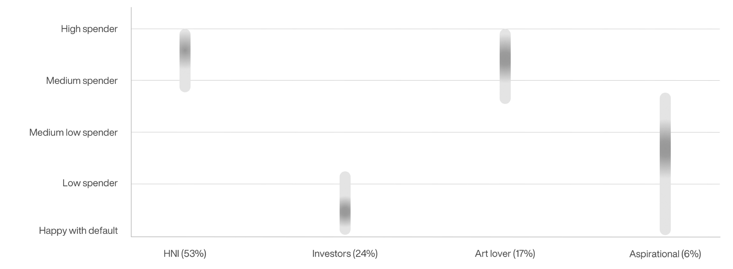
User segmentation
Majority of the users are the people who hold the highest social status, E.g. C-level executives, country heads, founders, musicians etc.
HNI (53%)
High net-worth individuals who want to
own lifestyle product
Investors (24%)
User’s who want to invest in the property and put it on rent
Art lover (17%)
Users who are artistic and appreciate the attention to
detail and craftsmanship
Aspirational (6%)
Users who want to own and maintain a high lifestyle product (home).
Few facts about users
During the user's data which was provided by sales and CEM's, I captured these facts about users, which helped me to understand user types.
90%
users live out of the country
14%
families are distributed
48%
buyers are referrals
16%
customers are above 38 and stay with family
76%
people buy because of personalisation
58%
do not take loan
User's customisation motivations
Total Environment projects there home as a lifestyle product which is generally a bit expensive compared to the competition. For most of the users, the motivation of buying a property and designing spaces are very different. Highly motivated users want to reflect who they are and their lifestyle through their homes.
User's spending pattern
The total environment enables users to design their spaces based on their needs and wants. Few user types wish to reflect their personality when they design spaces, and they don't mind spending more, but for few, it's different.
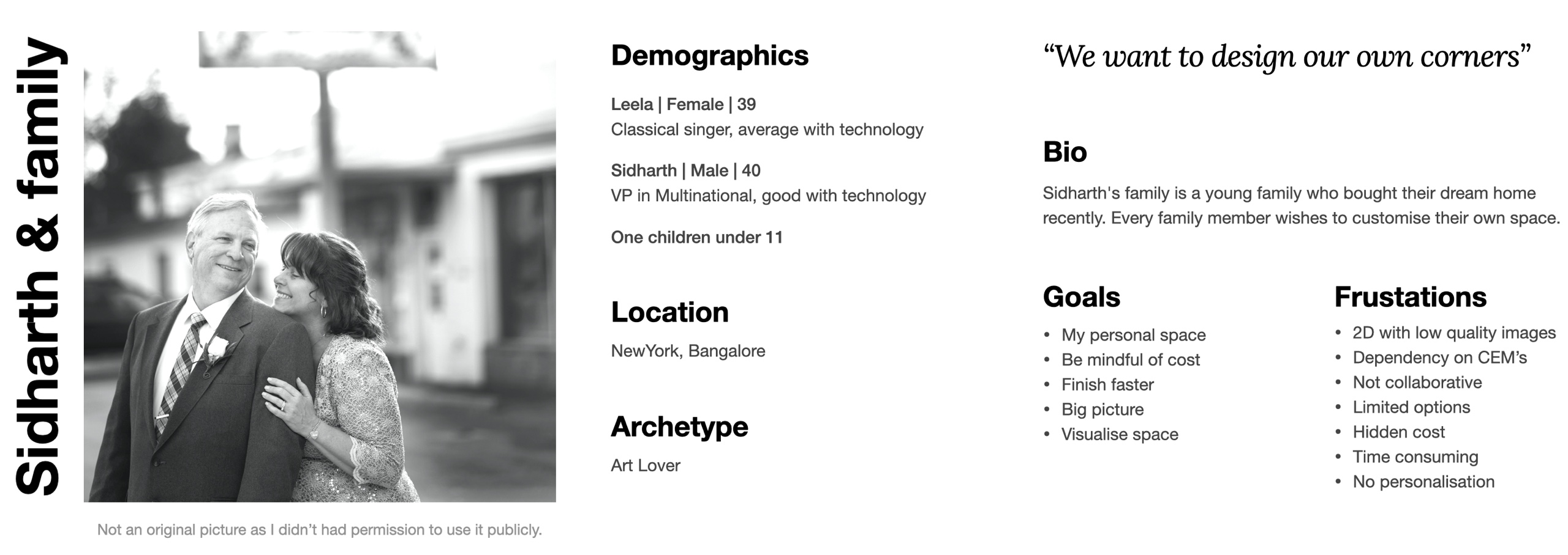
Persona
For qualitative research, I interviewed 3 families and 2 single users, and for quantitive, I got data from sales/marketing and CEM team, which I analysed in detail to identify user patterns.
User interview insights
- Users want to maintain versions because they said it takes time to decide and lack of versions creates fear of losing ideas.
- 14% of families are distributed and users feel frustrated because they are not able to collaborate with remote family members.
- The system fails to provide clear directions to users about what to expect and how the end output is going to be.
- Users feel irritated when they couldn’t finish customisation within the time frame because of the system limitations.
- Sometimes users don’t want to call CEM’s for smaller queries because they feel it might create a bad impression about them
- One change might cost a lot which is not clearly communicated by the system
- The system fails to give the impression of freedom and control while using
- When users doing customisation few users call CEM’s frequently. Sometimes a couple of times in a day which makes users feel bad
- Users want to see how space will look before signing off the customisation.
Research conclusion
Key design issues
- The 2D design was built at the sacrifice of the customisation, visual hierarchy and usability of the app.
- Increase in the number of screens and steps to access a feature.
- Essential functions, e.g. electricals, are offline customisation.
- Essential features, e.g. changing room dimensions, are buried and not easily discoverable by users.
- Multiple micro-interactions reminds users that their “actions are loading.”
- System stages don’t connect with what the real world stages are.
- Doesn’t communicate what the brand is about.
- Fails to give control to users.
Key user frustrations
- Difficult to navigate through the app.
- Unable to get what needs to be done first.
- Current users had to take the time to relearn the app.
- Users express their frustrations on how complicated it is.
- Both parties take many steps to accomplish their goals.
- It forces users to communicate offline.
- Doesn’t give a clear idea about how much they spent.
- Limited choices provided by the system.
Solution
- To build an experience that is user-centric and caters to the users' needs.
- Improving the customisation experience and visual hierarchy to help users to digest the information they need and learn how to use the app in a shorter time.
- To reorganise the flow and position of features so that users can achieve their goals quickly.
- Match with life.
- Easy on eyes.
- Playful, a kid should be able to use it.
Shaping research outcomes - User’s underserved needs
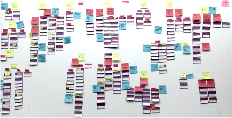
To document the research findings, I created two buckets:
- P1 - Personalisation (eDesign)
- P2- Others (other stages like buying, staying, etc.) in which I started adding users underserved needs/wants. Product managers, CEM's, Sales team and I did lots of brainstorming about what the immediate value we wish to provide to the users in terms of the eDesign. All executives agreed that the underserved personalisation needs was empowering customers to finish customisation faster, which will result in completing projects (construction) more quickly. However, there were a lot of different ideas for what the service would do beyond that core benefit, but we as a group decided to focus on customisation first, which will save cost on the long run.
Storyboards and
Product maturity continuum
I used storyboards for conveying user's underserved needs in the form of stories to show how our product would fit into the lives of customers. Storyboard gave everyone a vision of the product experience I wanted. Product manager and I defined our product maturity continuum.
Functional
Works as programmed
Usable
Can use without difficulty
Convenient
Super easy to use, works like I think
Pleasurable
A memorable experience worth sharing
Reliable
Is available and accurate
Meaningful
Has personal significance
03. Physical to digital___
Customisation flow - Stages - Testing
Customisation flow
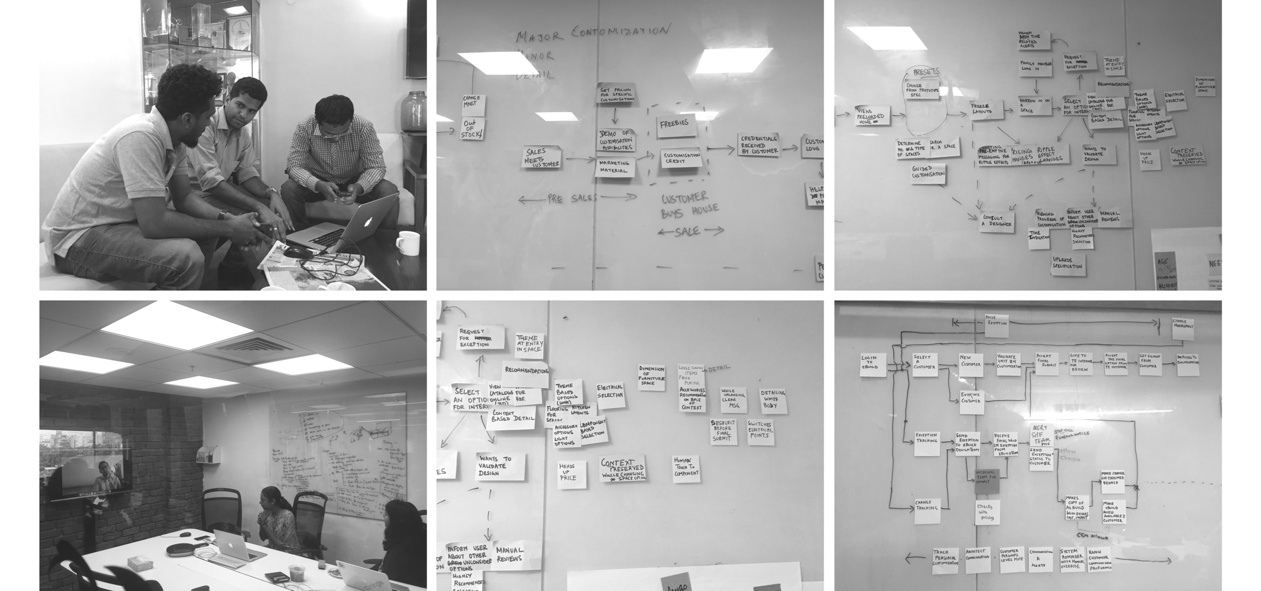
For the flow, the idea was that the product must tell a story to connect with consumers, and that story also should connect with the real world (sales & construction). To understand the real-world flow, I visited construction sites, observed how sales/CME team explained to the users, tried to match how stages work at construction and in e-design. I discussed the flow issues with users, and I had a few workshops with CEM’s and sales teams to understand users knowledge about the stages of construction and how do they align with the product.
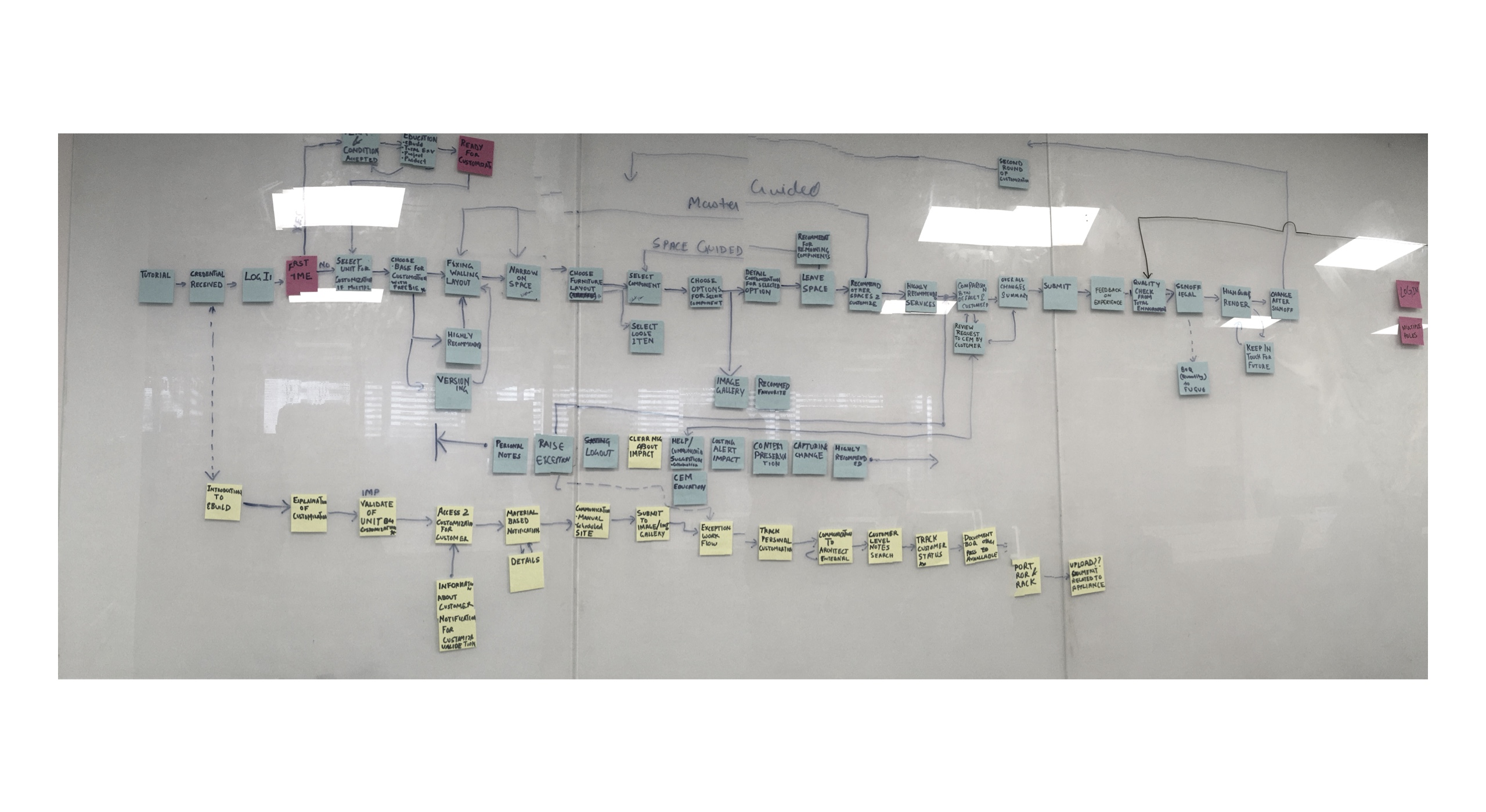
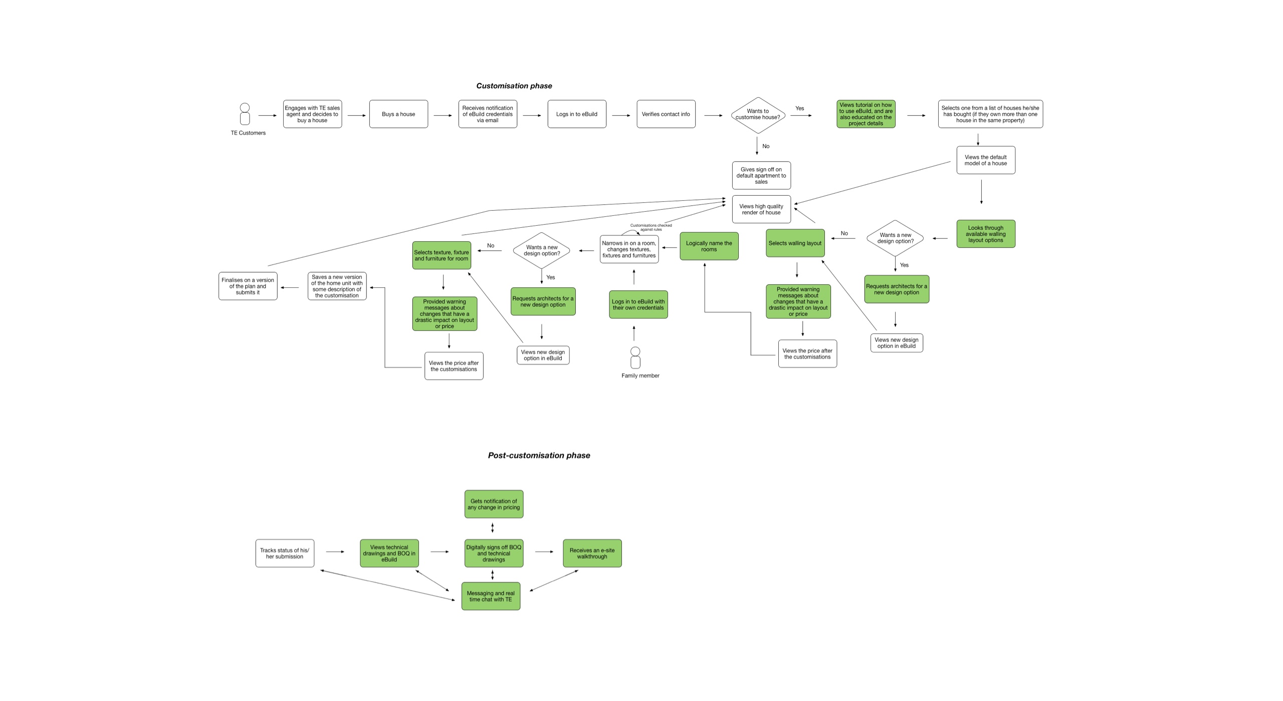
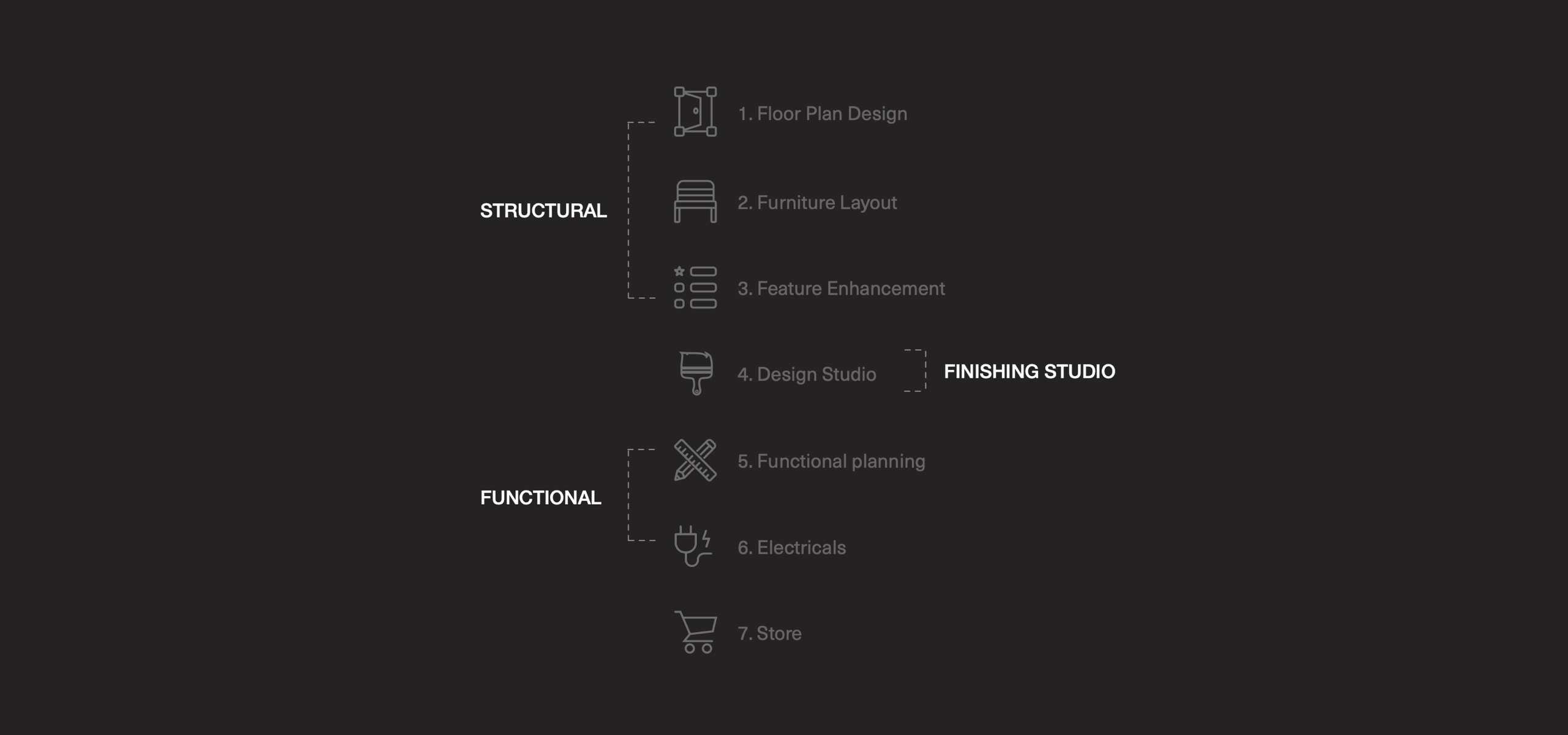
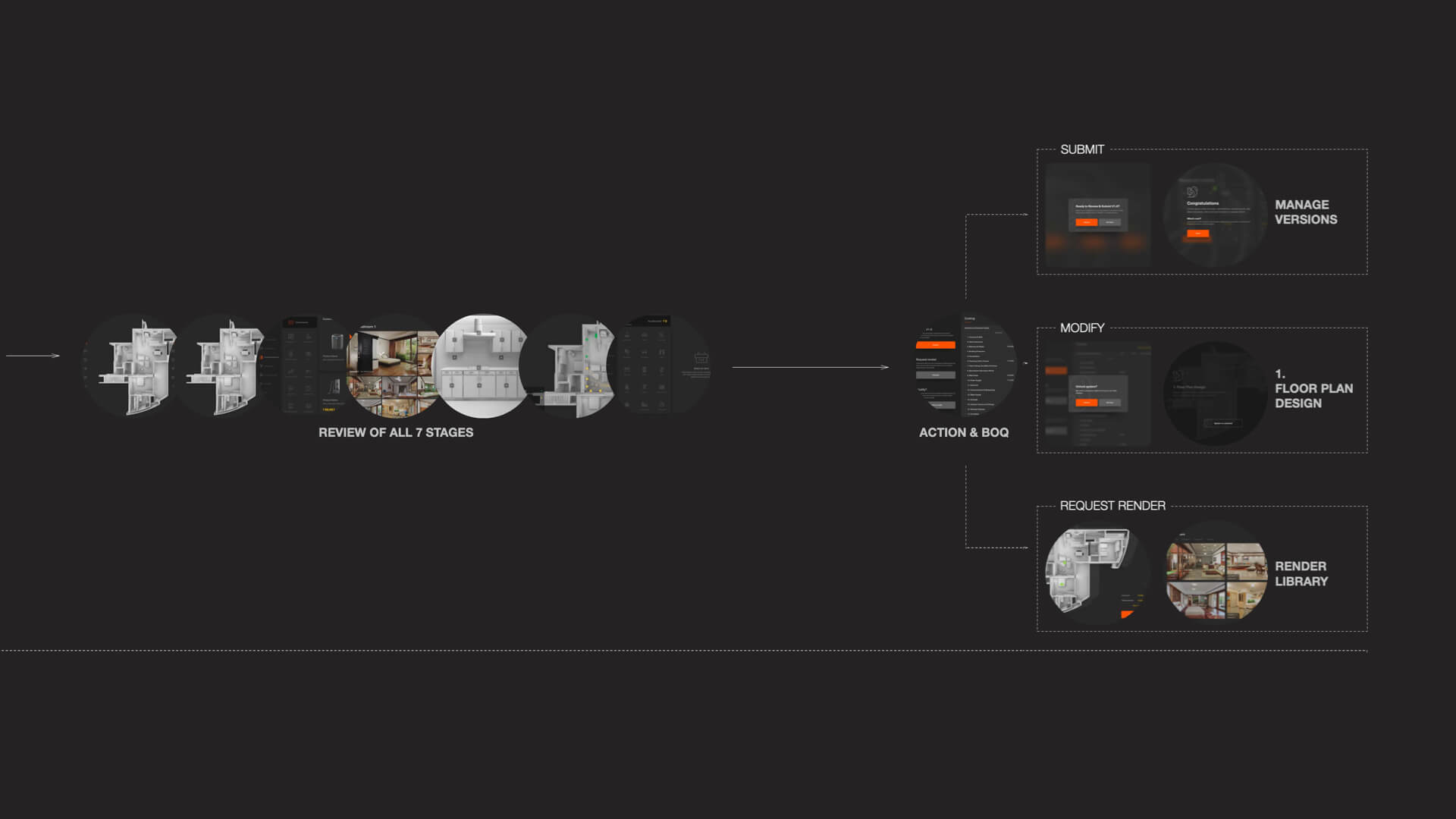
7 stages of customisation
I used the sequencing technique to define a flow for the application because users are more likely to take action when complex tasks are broken down into smaller tasks. Based on multiple studies, I aligned eDesign customisation with the real world. How the user perceives stages and how they have been communicated during sales discussions.
7 is the number because construction happens in 7 stages for all TE projects, and payments are tied to all 7 stages. I wanted to keep that number consistent but at the max side because users are well aware of this number (stages).
During user study, I observed sales executives used to group customisation stages, and they hardly used to touch all 13 stages of customisation. They used to group systems 13 stages into 6-7 steps while explaining to the prospective buyers. Walling & furniture, components (functional planing), aesthetic (design studio), addons (feature enhancement), electricals and landscape for gardens.
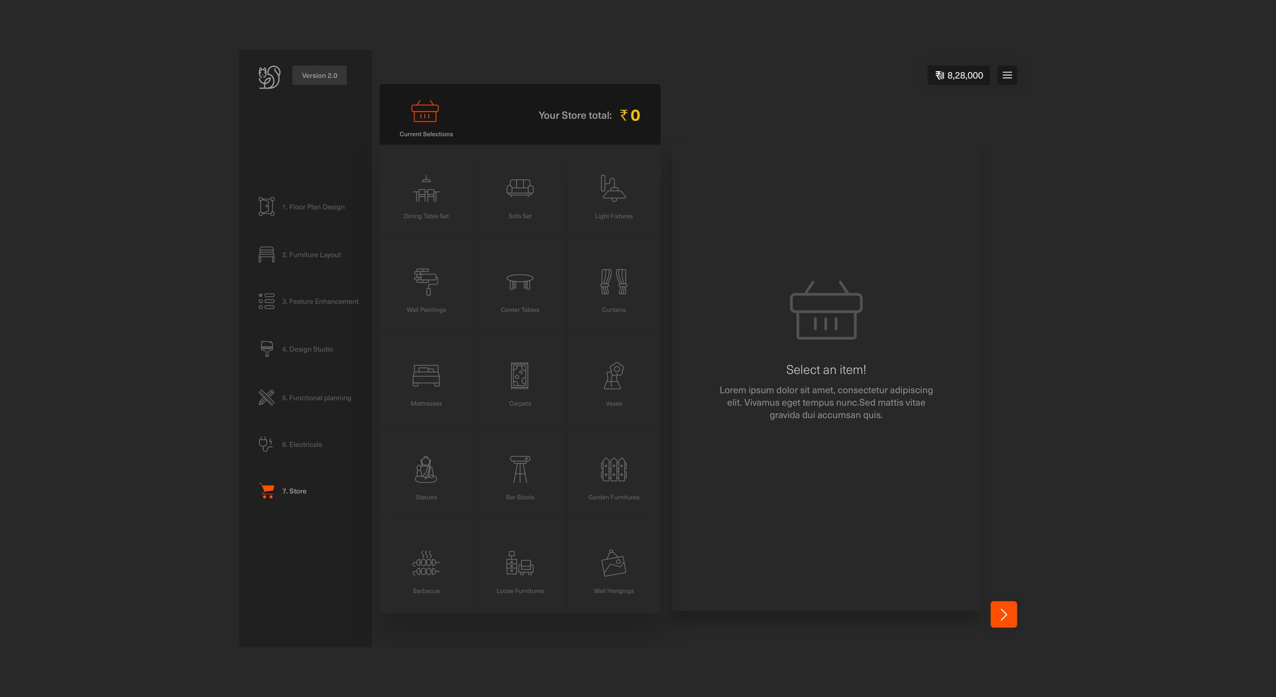
I divided customisation stages into logical 7 steps. 6 were aligned with the TE's construction stages, and all sub-stages were grouped into main stages. 7th stage become Store in the product to provide more addons and boost revenue. The organisation welcomed this and was adopted at the organisation level. The marketing team worked with CEM's and Sales teams to define the messaging for customers.
Flow testing
Once I had signoff from all key stakeholders, I decided to test these stages with the users to see if they would understand what these stages mean and reasons behind it (which we planned to cover in sales meetings, CEM meetings and products education/help section).
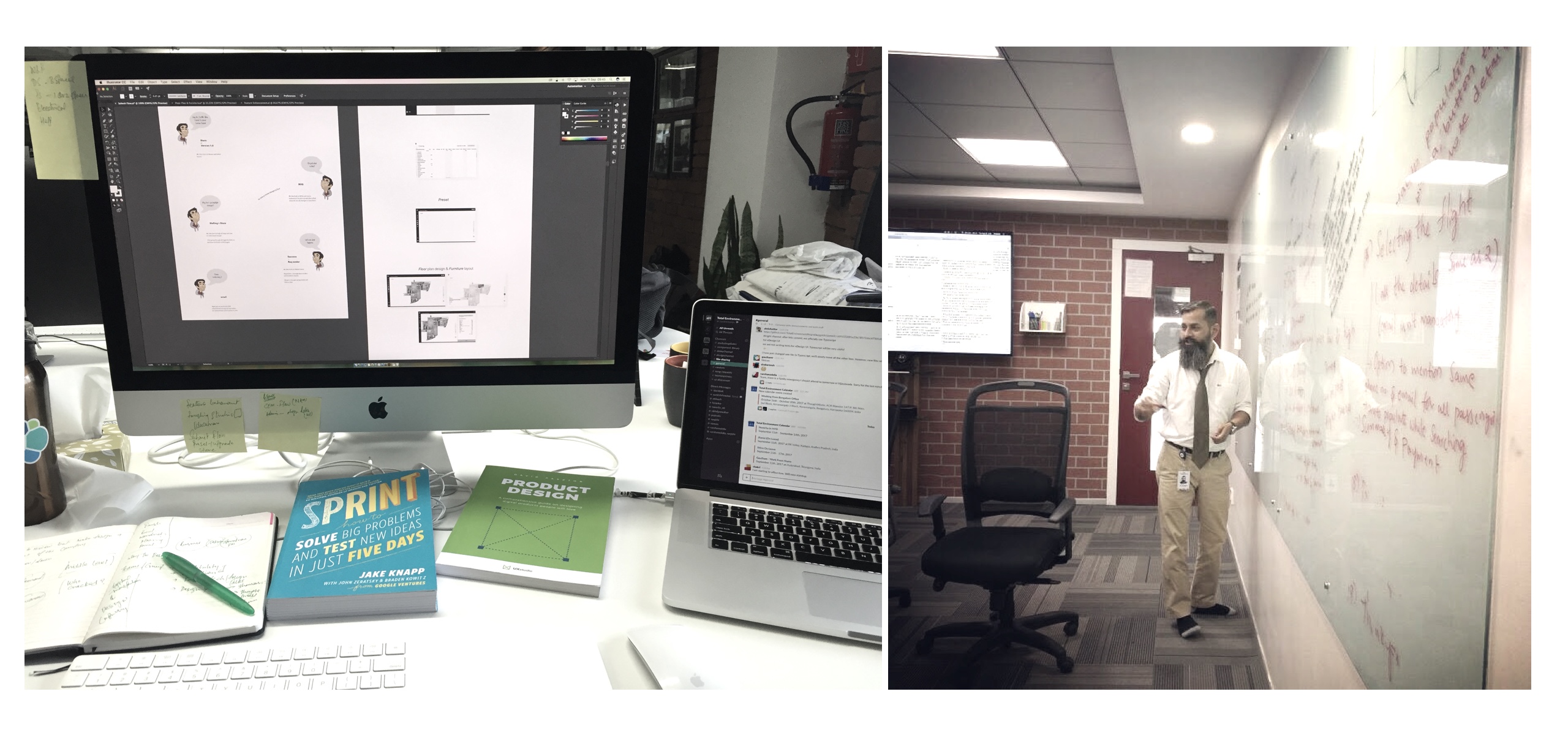
To test, I quickly designed prototypes (wireframes) to cover all stages and what will come in each step.
For testing, I divided group users into two waves.
Wave 1 - 18 prospective users
Sales meetings with customers with supporting materials. I used to go to the sales office at the construction site, and while the sales executive is explaining customisation, I used to handover my design to the user and ask for their feedback. Tested with 18 users and 12 users were happy and were able to understand and relate the stages. 6 users had questions like why electrical is separate when we (Sales and I) explained that it's quite a significant stage of customisation where you can change electrical sockets, make connections etc. they understood why it's separate.
Wave 2 - 9 Existing customers
I tested with 9 existing customers who were already in customisation mode and were using the current (old) product with CEM's.
None of the customers had any significant concerns or questions with the flow. Instead, there was a lot of head-nodding as they went through the mockups, and unsolicited comments like "Oh, this is great." They did have minor comments, questions, and suggestions but mostly about designs. I gained an even more in-depth understanding of what customers wanted in the product.
But there was clearly much stronger interest in our Wave 2 product. I felt confident that I had achieved an adequate level of simplification with flow and designs to move forward. Lots of customers asked me when this new product will live and if they can switch to this from the old one.
When I explained that it hadn't been built yet, they all asked if CEM's would please take their email address and notify them when it will be available for them.
Results showed that this structure reduces cognitive and memory load and flow was quite easy for users to understand.
Detailed flow
04. Design___
Study TE's design philosophy - Inspiration - Solution approach - Direction - Designs - Test
Design taste - study
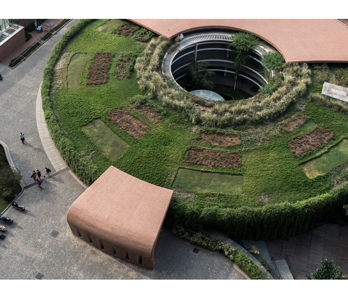
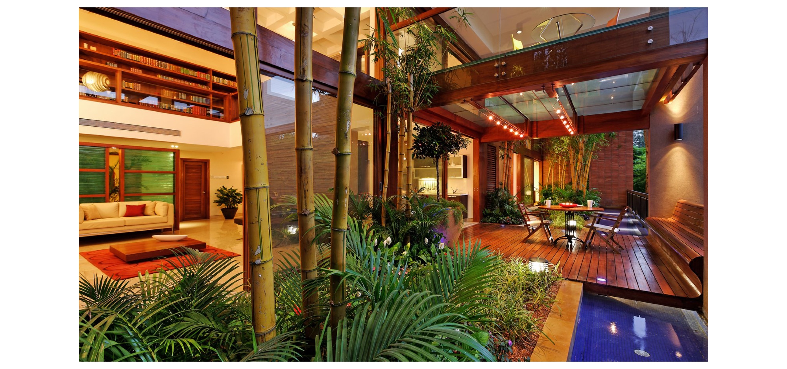
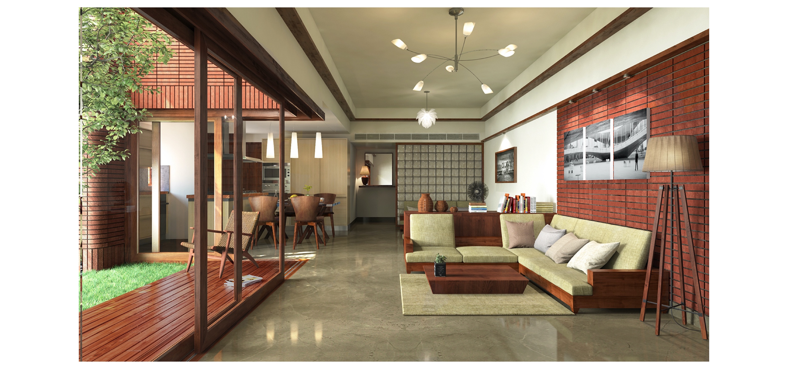
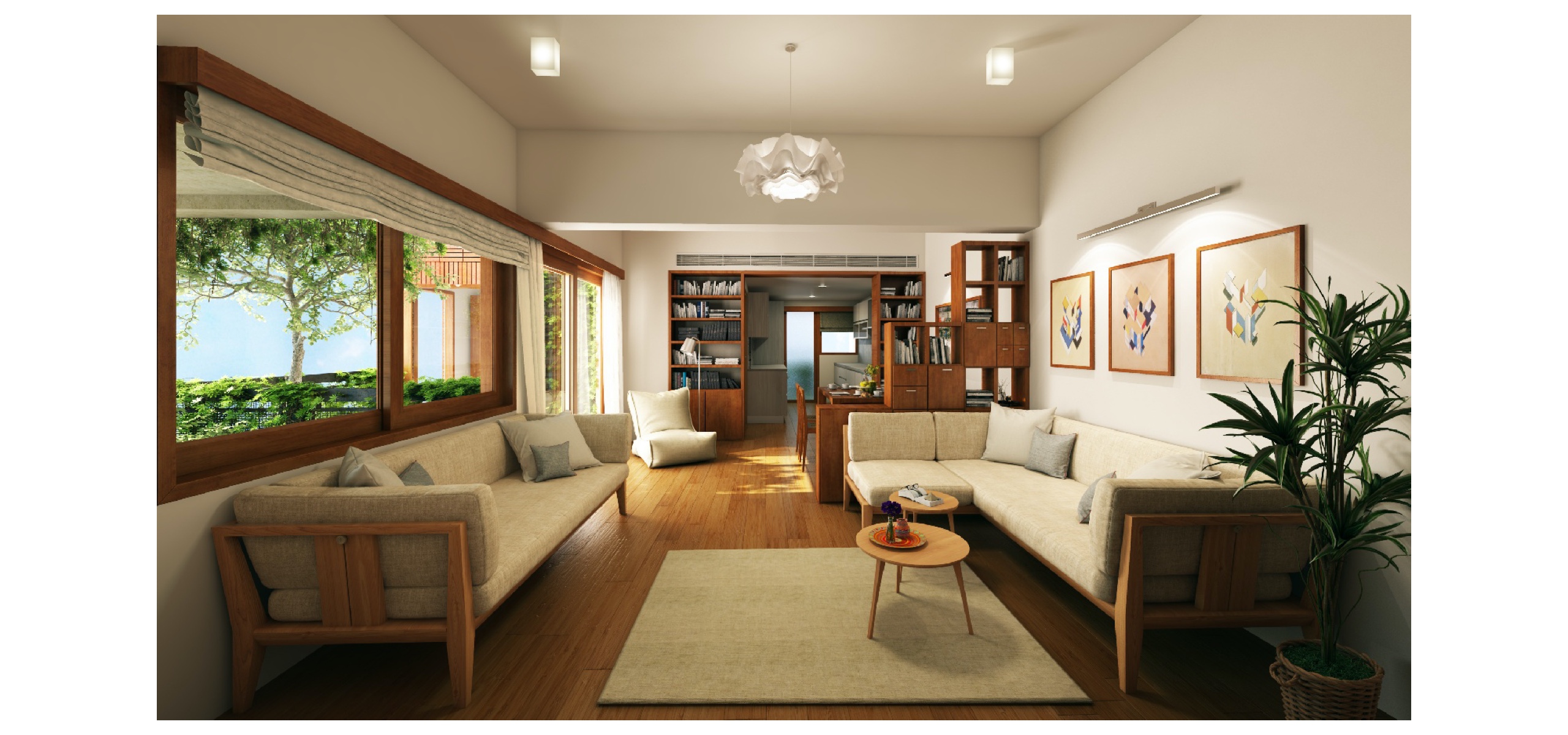
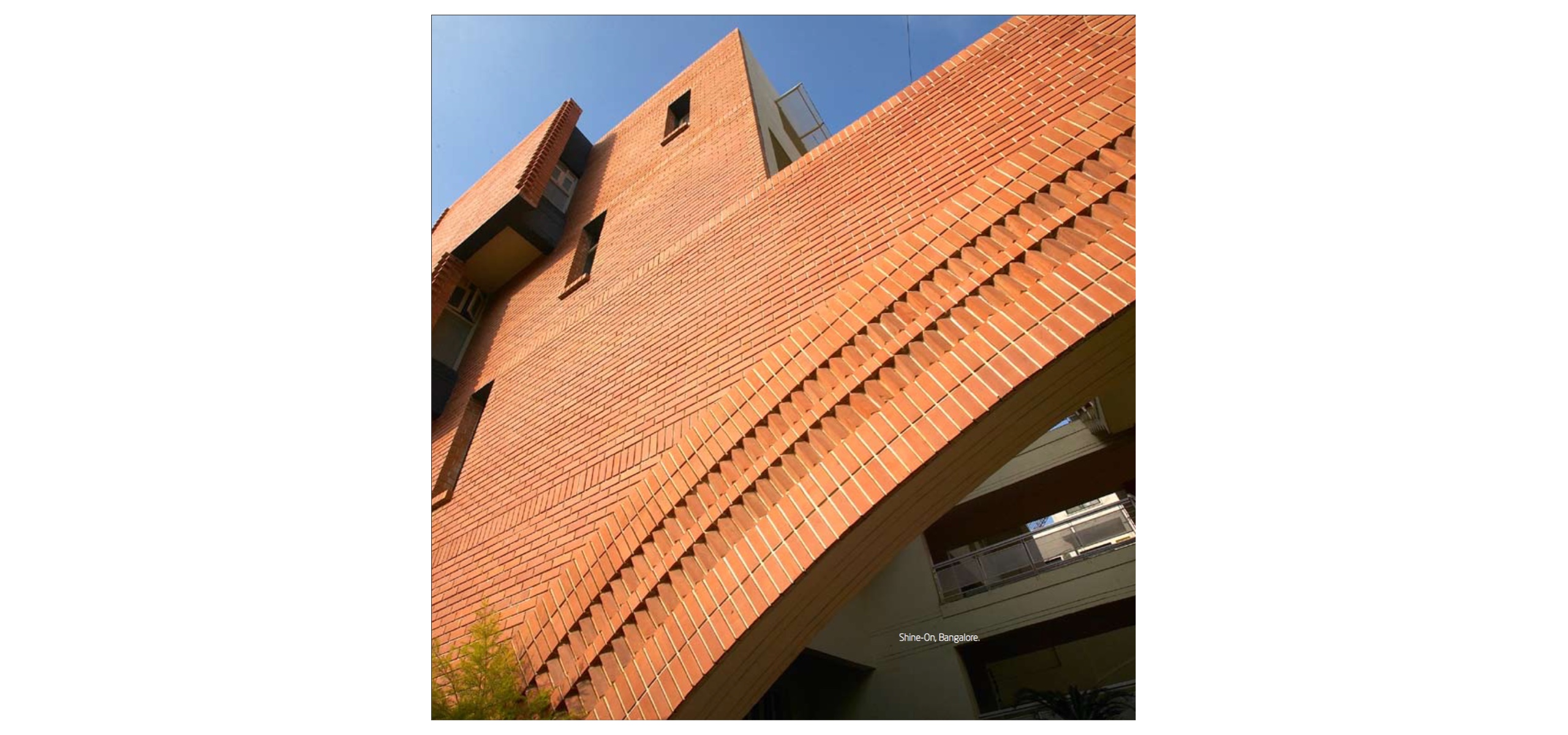
The Total Environment is an award-winning design-led architectural firm. Their commitment to the craft of constructions and attention to details is legendary.
Founder architects Shibanee & Kamal have a very minimal yet elegant taste when it comes to design.
To study, I studied their homes in detail, what material they use, furniture designs, colour choices, print materials and words which they use when they explain their work.
The idea was to translate physical design language into digital. It should give an impression of the extension of the brand.
Inspiration & direction
Based on observations, multiple discussions and study I came up with these words which became the direction for the product’s design.
- Simplify
- Play
- Like solving a Puzzle
- Connect
- Explore
- Stress-free
- Minimal but interactive
- Easy of eyes
One question I was asking at every stage was
“Are you attractive?”
Solution approach
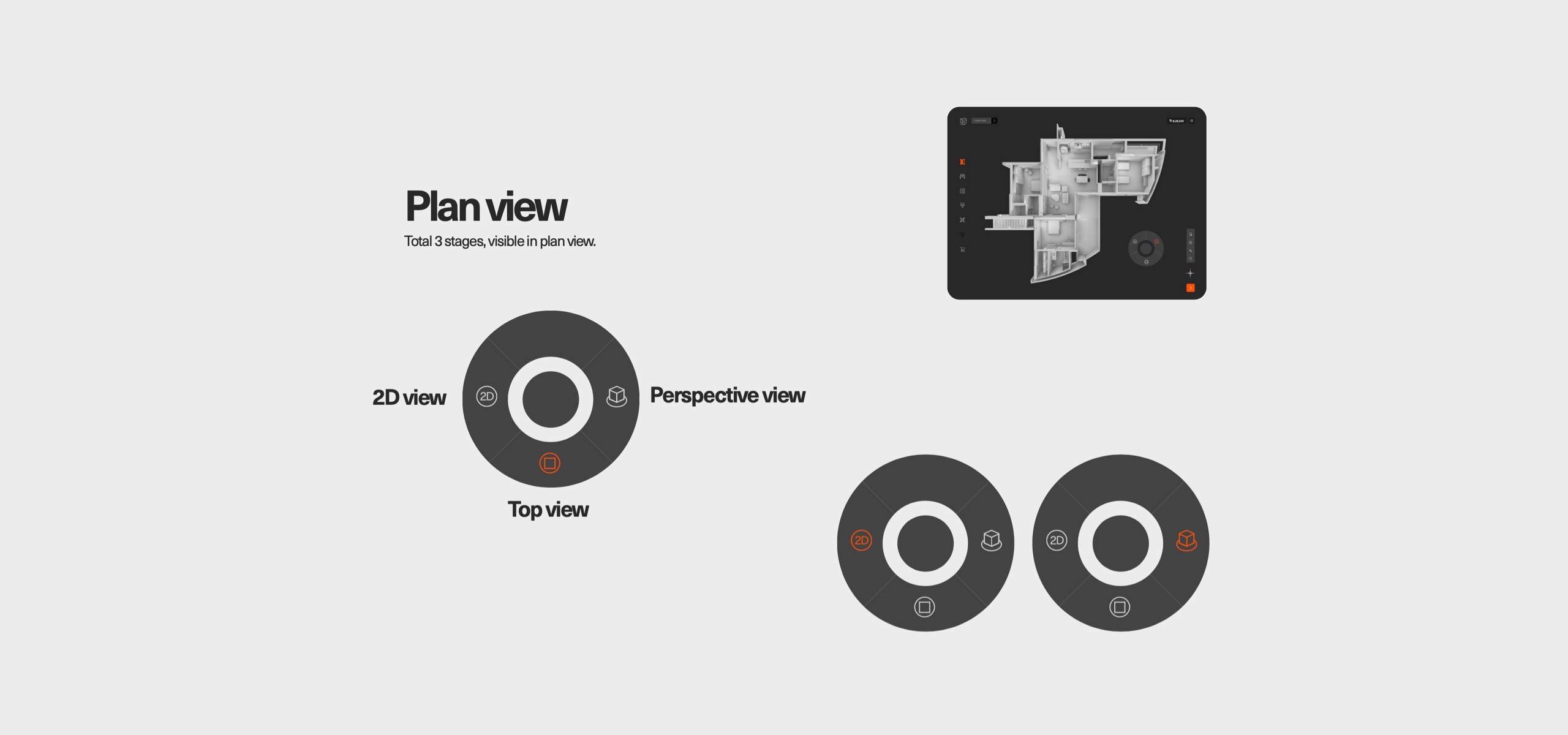
For home customisation in 3D experience, I wanted to give freedom to the users to play, after lots of iterations and technical discussions we planned three ways
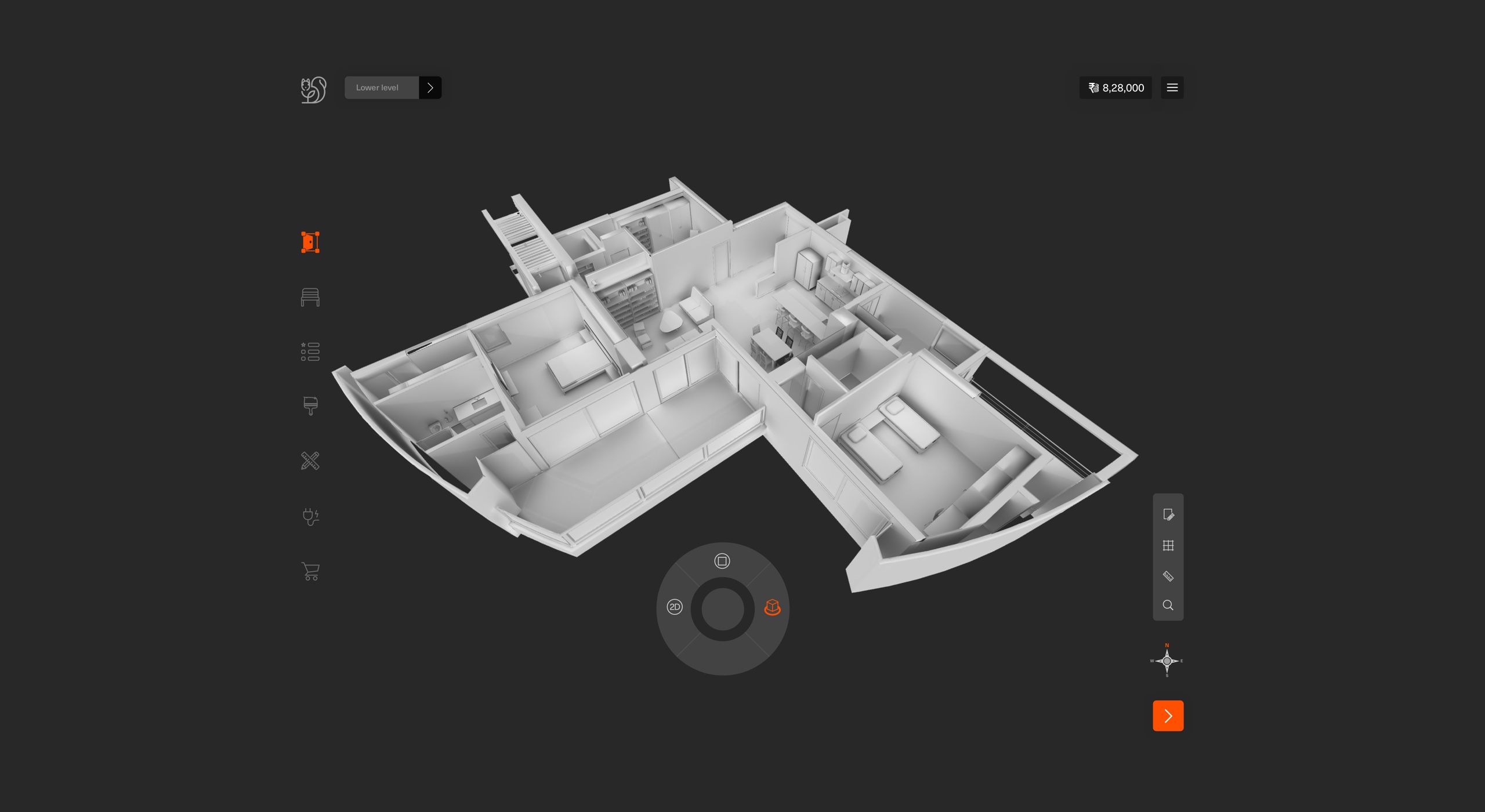
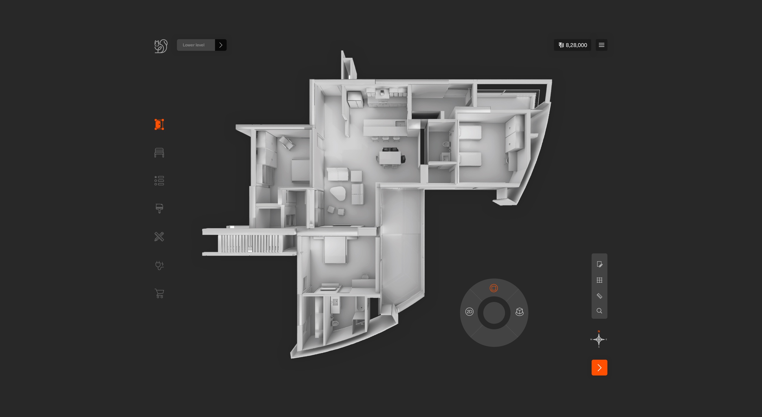
Top view / Perspective view / Landed view
Validating 3D solution with users
I aimed for a solution which the user would enjoy playing with. Something which they feel happy and engaged when they use it.
At the interaction level, the focus was to help users in decision making. I focused on minimal interaction and showed all the necessary information in the first view. Started exploring various layout and navigation options, and after lots of discussions with team and stakeholders, I closed on the design direction which had a lesser learning curve.
Will users understand 3D?
To test 3D solution approach, I decided to test with the different types of users. I divided them into two buckets.
Powers users: who are tech-savvy. Users who understand modern interactions.
Non-power users: who aren't tech-savvy, but can use a computer and smartphones. In this range, major age groups are 50+ users.
Why non-power users? Data showed that a variety of users uses eDesign. People customise their homes with parents, and sometimes parents would like to customise their own space. So they must be able to use eDesign without much of a hand-holding.
I reached out to CEM and sales team to get at least 6-10 users for each category which was a big ask knowing their client tale. Both teams suggested we should target users who are in the process of customisation or coming to the sales (construction site) office to see demo apartment/villa.
I tested with 15 users (7 power users and 8 Non-power users).
Overall, everyone liked this approach because they haven't seen anything like this earlier. But at the same time, there were tons of questions users had. Like:
- Why is 3D grayscale?
- Why are you now showing colours/materials, etc.? - At the same time, users also understood that the quality of materials in 3D would not be realistic.
- How will multilevel customisation work? - I had this covered in my demo 3D, and I showed them how the selection works for levels.
- The electrical connection had only one colour which I changed it to the multiple colours to show the relation better.
After a thorough walkthrough, I used to ask users "Will you use this?", "Do you think this will empower you?" and "Do you feel excited?".
To my surprise, all 15 said: "it's going to be an experience." They felt safe because of two-level support incase if they are stuck. On-demand help in product and CEM's are just a call away.
Design direction
While doing a study I and visual designer was capturing all necessary details to start the mood board for this product. I defined these principles to set the direction for the visuals.
Stressfree / Minimal and aesthetic / Easy of eyes / Extension of brand

Light mode vs dark mode (A vs B)
When the tech team rolled out the final rendering of 3D, I started playing with the colour options for application as it was heavily dependent on the quality of the 3D.
The research said that at the peak of customisation stage every user spends around average 1.5-4 hrs daily which spans across a few weeks/months, in some rare cases few users use this application for 7-10 hrs which spans across a few days because they want to finish faster.
Screens should be "Stress-free" and "Easy on eyes" is what one of my goals was. But at the same time, I wanted 3D to stand out because that's the core of the application.
I designed two versions - light and dark mode, which I wanted to work based on time and I decided to test.
I reached out to sales and CEM's to connect to the users:
Sales: at the demo apartment (construction site) when salespeople used to walk prospective users customisation stages and talk about eDesign I used to show designs and ask which one they would prefer.
CEM's: when CEM's used to meet users for customisation discussion if I am there, I used to show and in some cases I shared designs with CEM's and they used to show on iPad ask users which one they prefer.
Tested with 24 users, and overwhelmingly, the users preferred the darker mode.
- 7 users liked the approach of changing background based on the time
- 17 users felt that 3D stands out on dark mode.
During testing, one of the users mentioned.
"It's subtle."
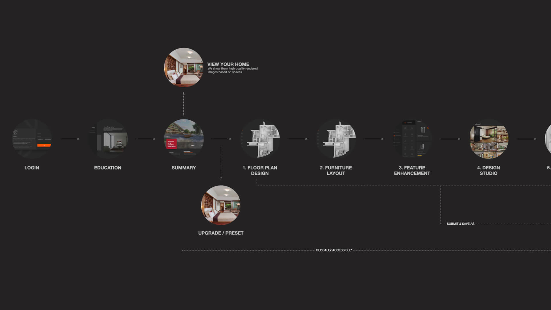
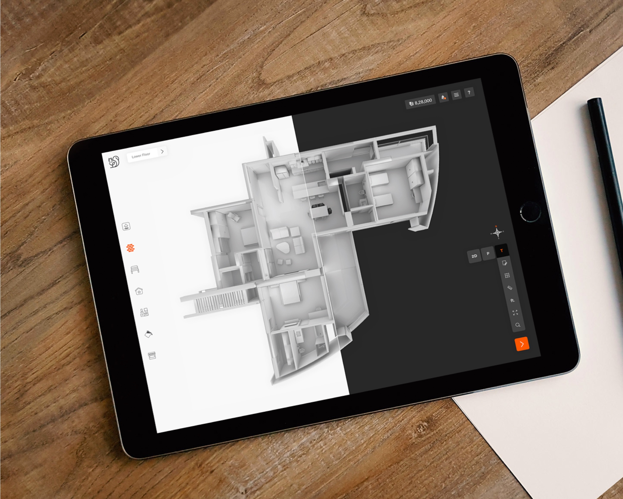
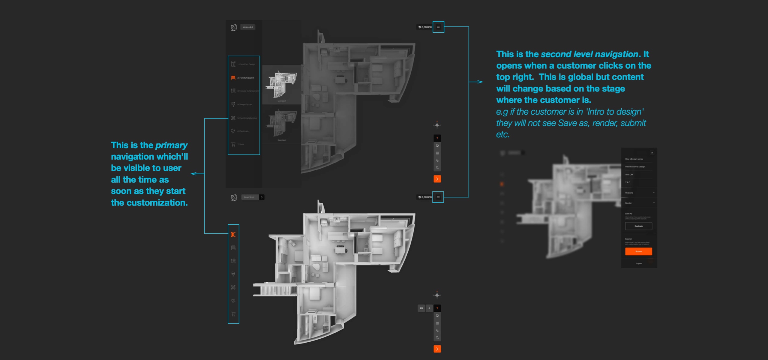
Navigation
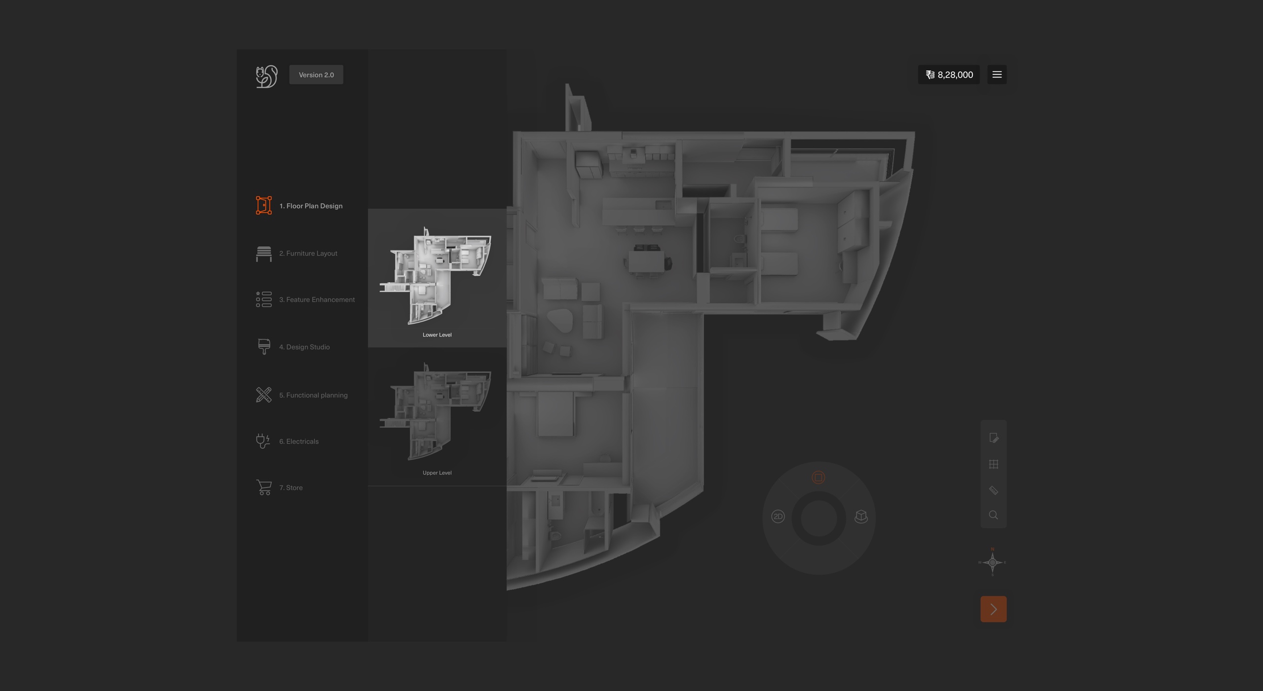
Model - hybrid navigation
I chose a hybrid structure because they are typical of intricate designs and often strive to flatten the information hierarchy to reduce the number of steps to content. Also, I wanted to give freedom to users to jump anywhere whenever they would like to reference something in another stage.
Primary
This is on the left side of the screen which travels all eDesign stages & store.
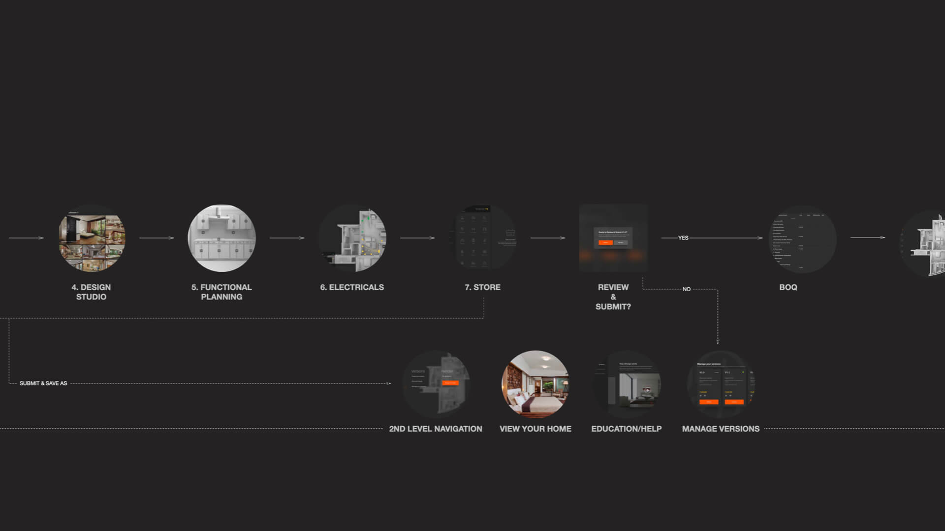
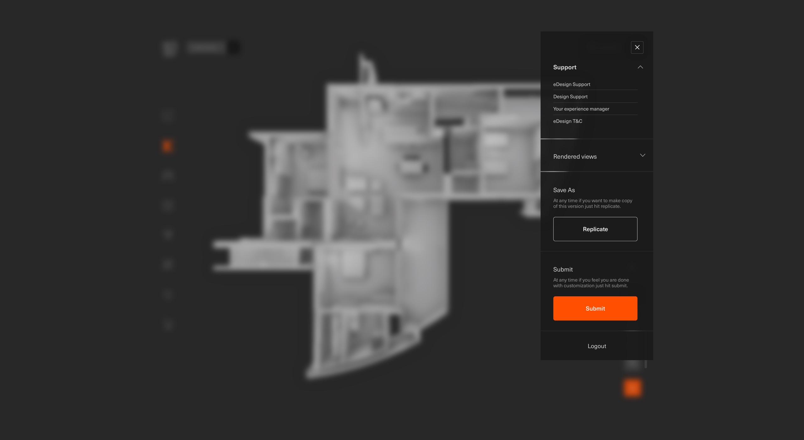
Second level navigation (hamburger)
This opens when a customer clicks on the top right. This is global but the content will change based on the stage where the customer is. e.g if the customer is in 'Intro to design' they will not see Save as, render, submit etc.
Onboarding and
Intelligent on-demand help
For this complex application, it was critical to design a smooth onboarding and on-demand help.
I planned onboarding for each stage and during the customisation ay any time if the user wants help system recognises at what stage they are in and suggests help in the form of actions and content.
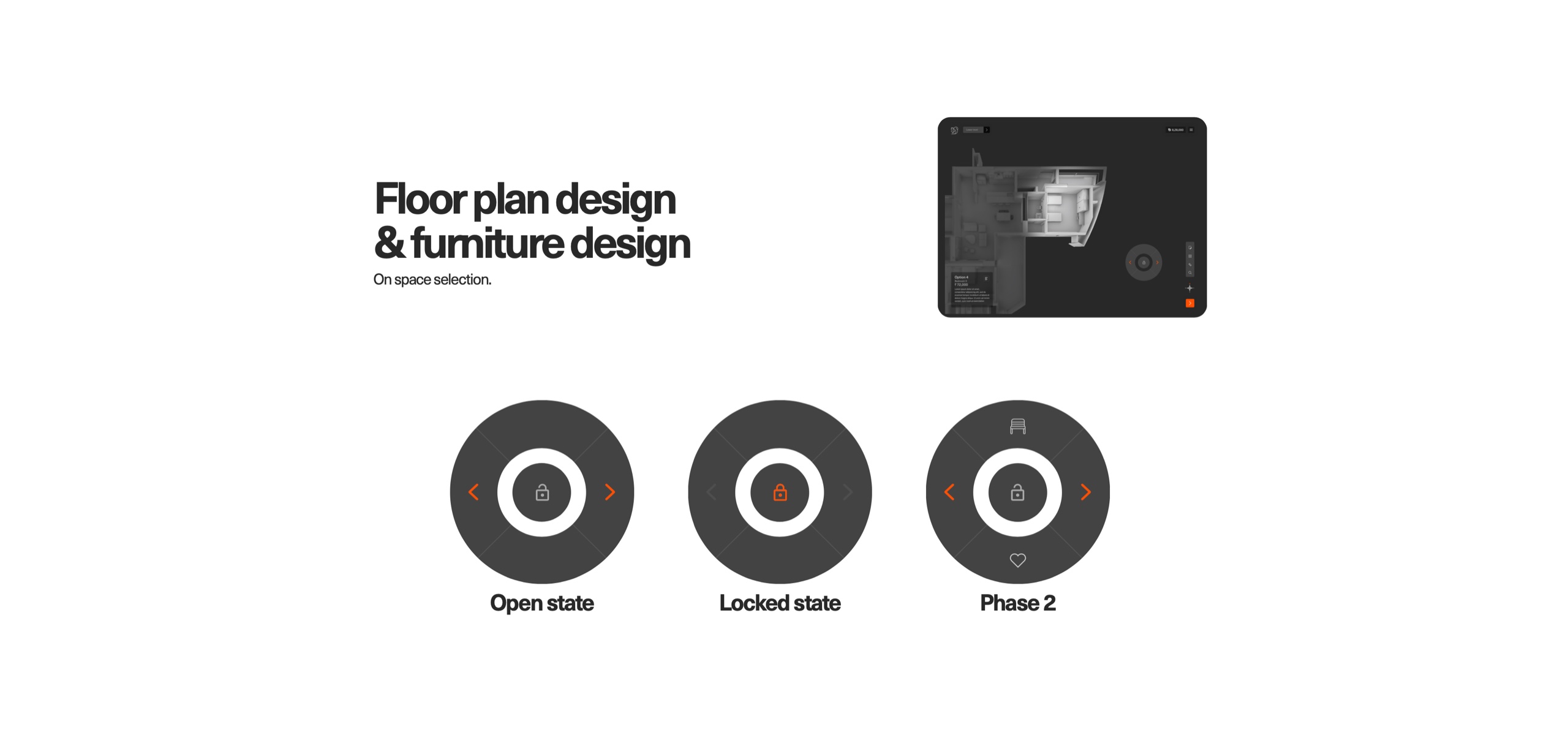
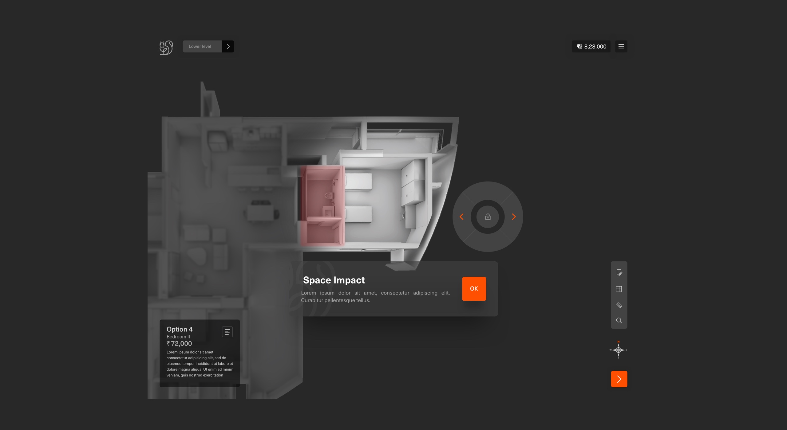
Give users control - Toggle
Through this floating toggle feature, the idea was to give user control and freedom. This toggle travels at most of the customisation (3D) stages and it changes based on the situation where the user is.
"It helps users in error prevention and recall."
How does toggle work?
Stages and toggle interaction logic
Toggle behaves differently based on the stage the user is at, but interaction is consistent. No surprises!
Landing
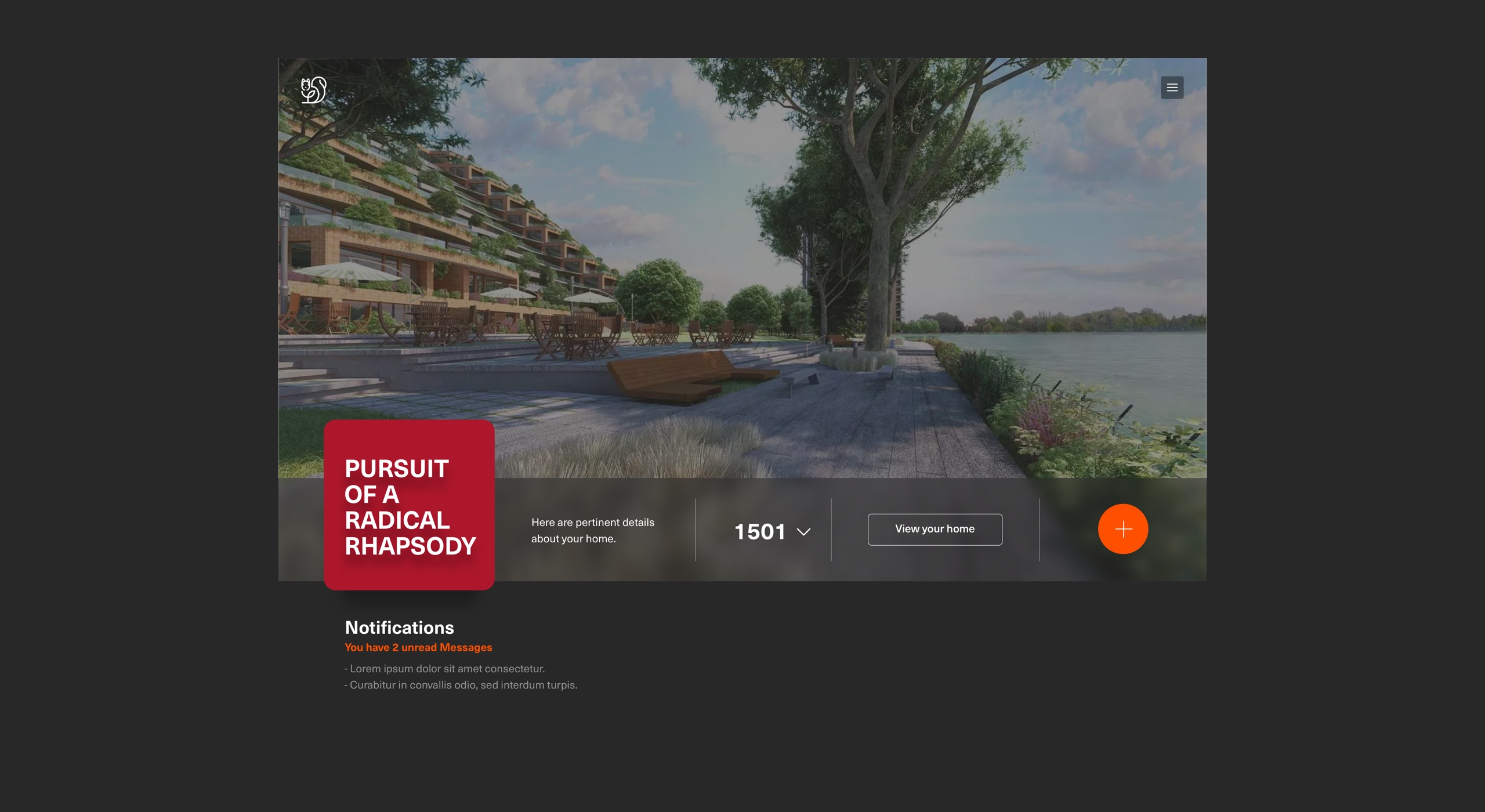
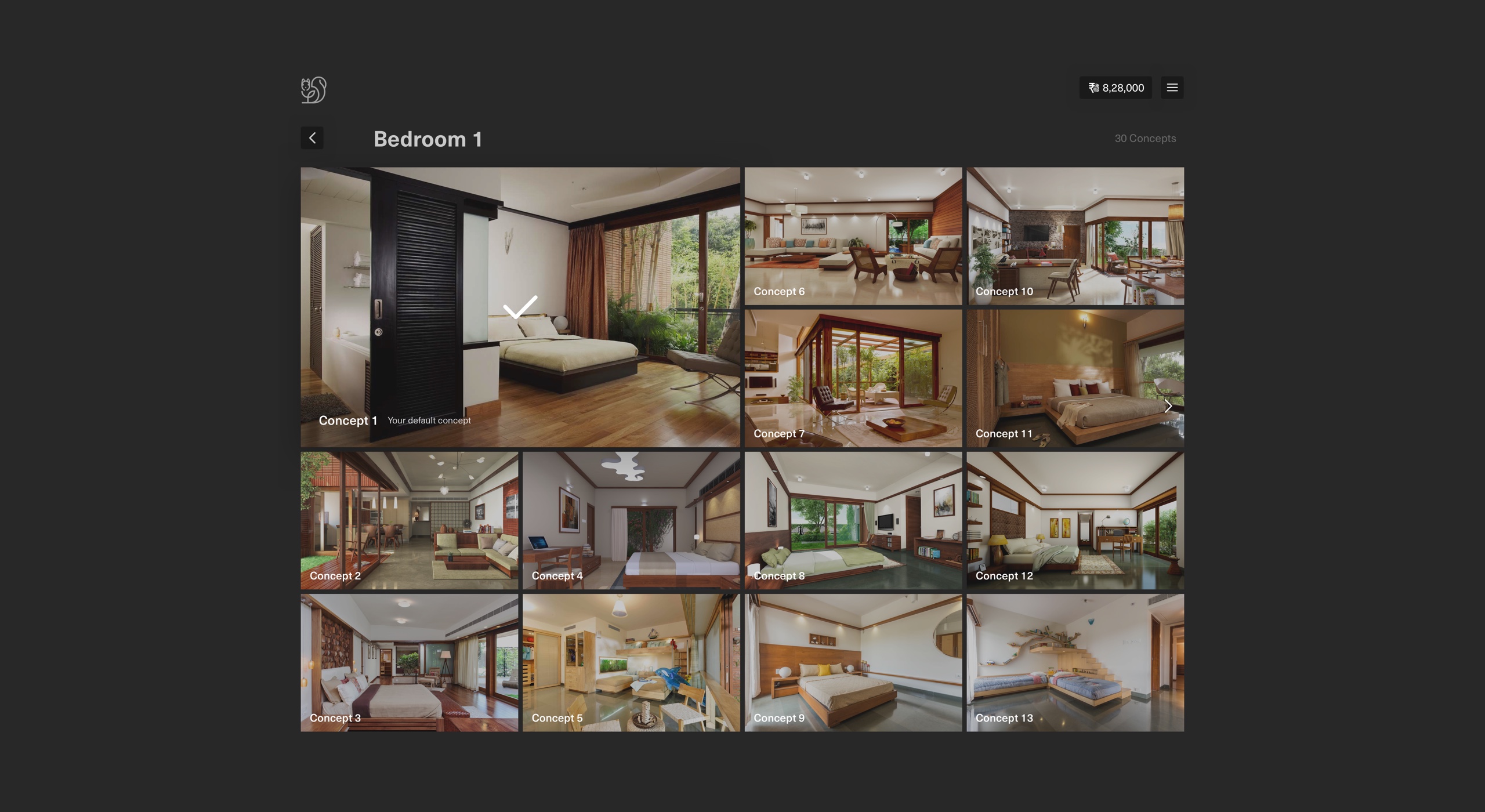
To show a snapshot of important info to a user. Project image is shown to make an emotional connection. This screen aims to guide a customer through the customisation process by showing critical info like project name, unit number, number of days abatable to finish customisation & notifications.
Presets and versions
Presets
Presets are for unique needs based on data. Users can start with a predesigned option that has been crafted for individual needs. This is also an access point to preview their default home.
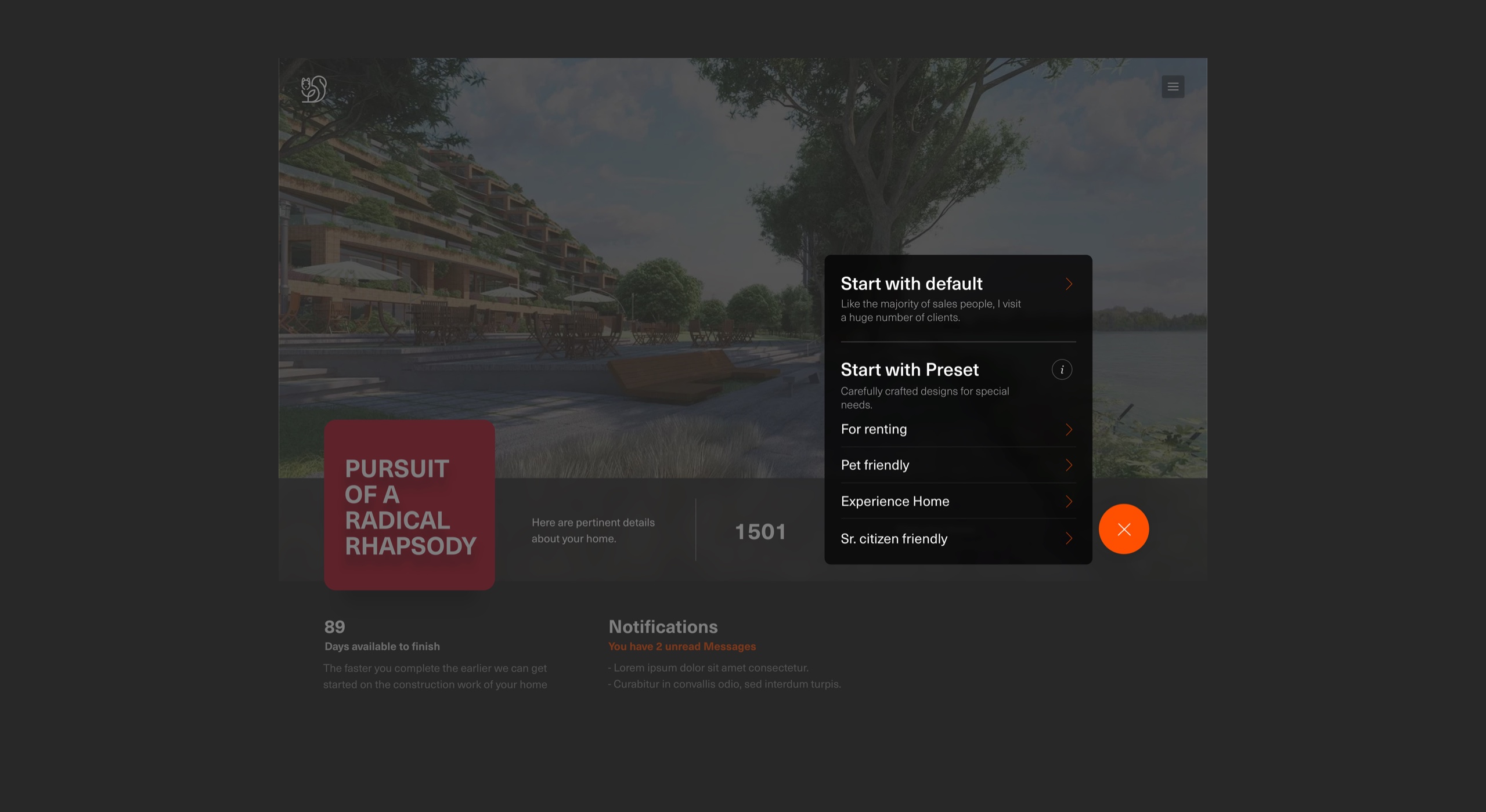
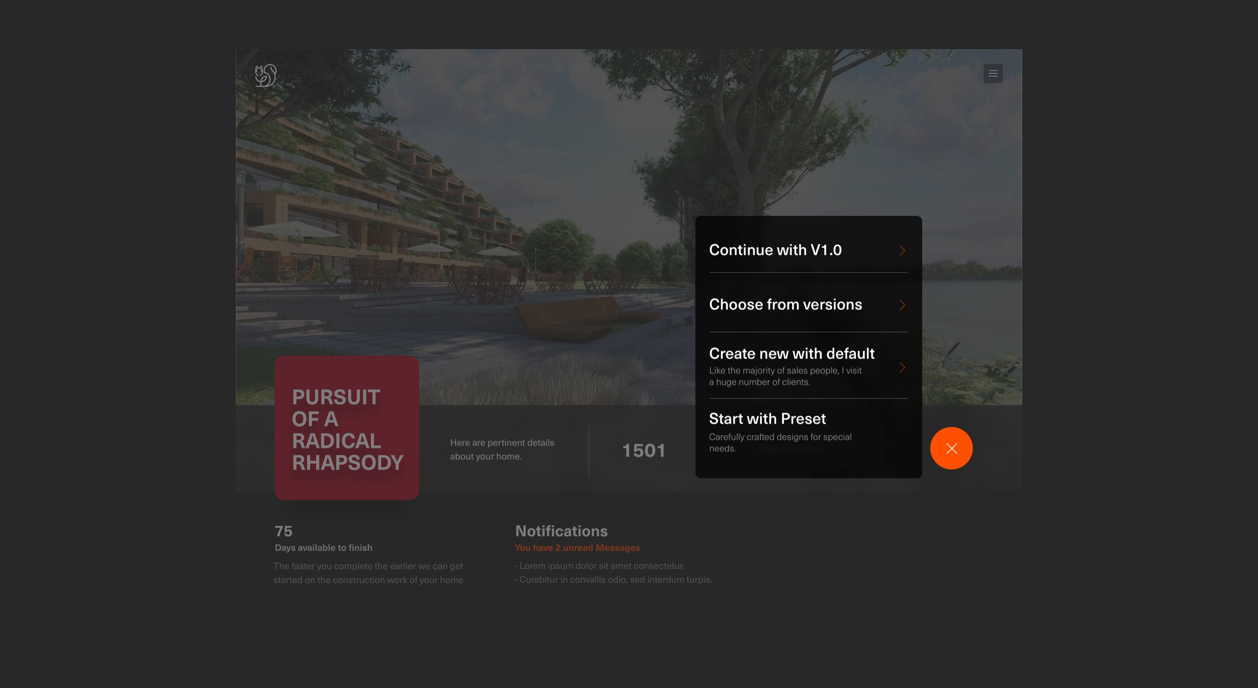
Versions
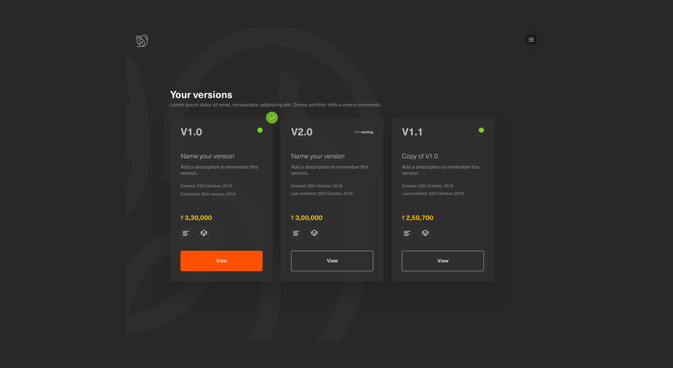
Users can start with default or can start with the last updated version or can create a new version. It allows all family members to freely experiment/maintain design ideas/customisations without the fear of losing the changes. The system saves and creates a version for them. Versions also help them collaborate with family members in the longer run. To give more personalisation, users can create versions and add their name and description. Users can see detailed changes and cost in BOQ format.
Users: personalised spaces & personal versions
Business: up-selling
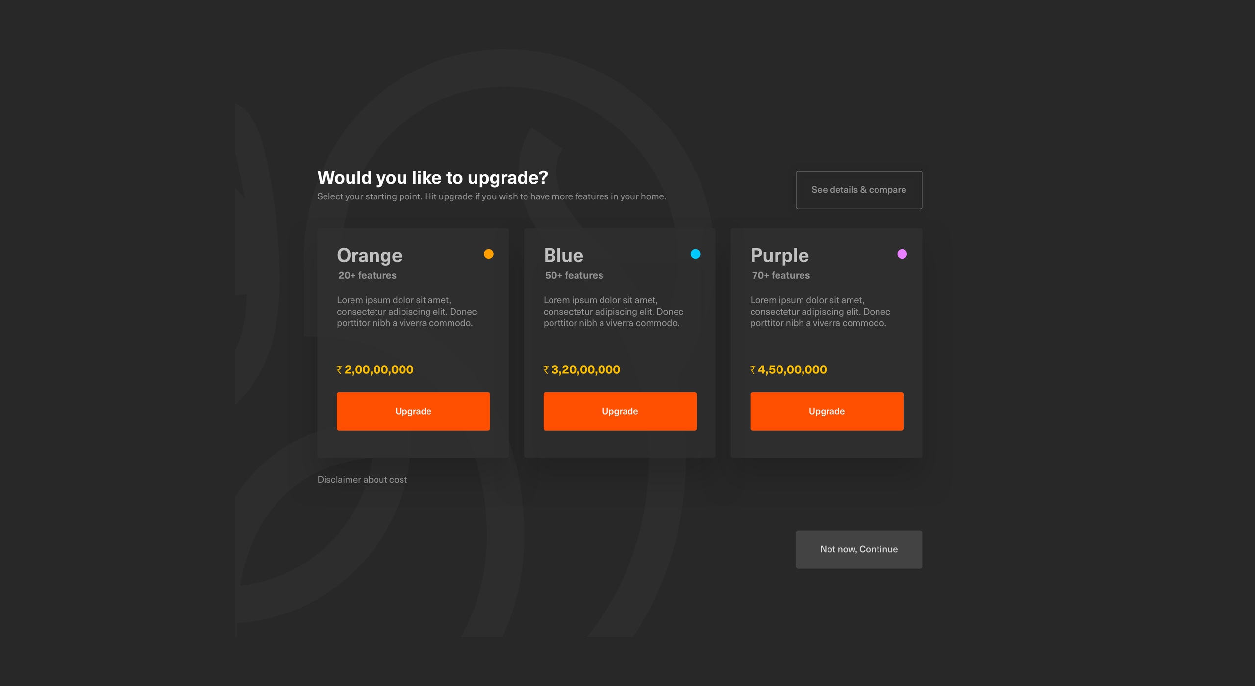
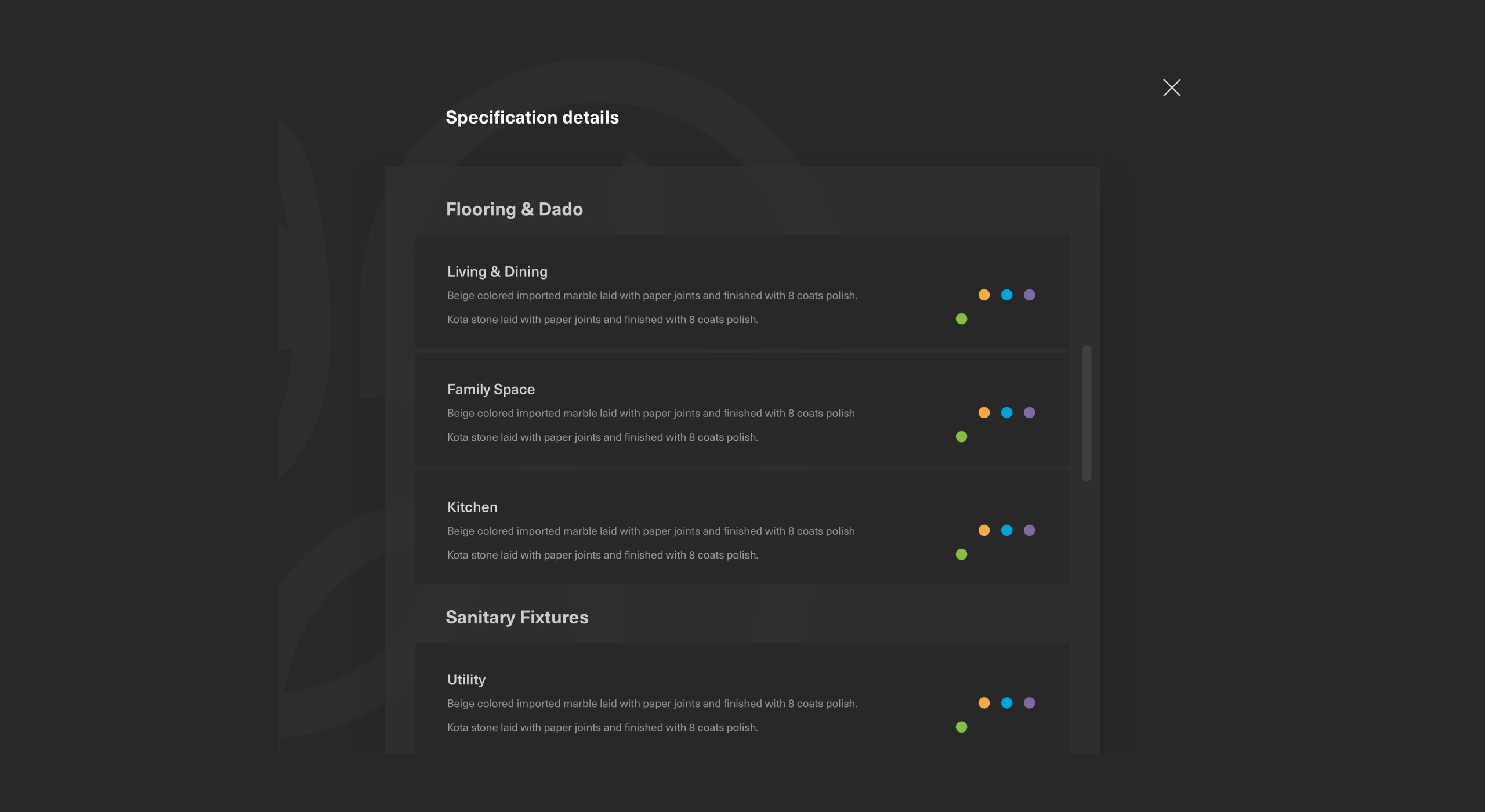
One-click upgrade
Users can upgrade from their default specification to the upper one for getting more features and value for their home. If the user opted for the basic one this system enables them to upgrade based on their needs and budget.
User: home with more features. Business: up-selling
Add an extra room in your apartment? - Walling layout
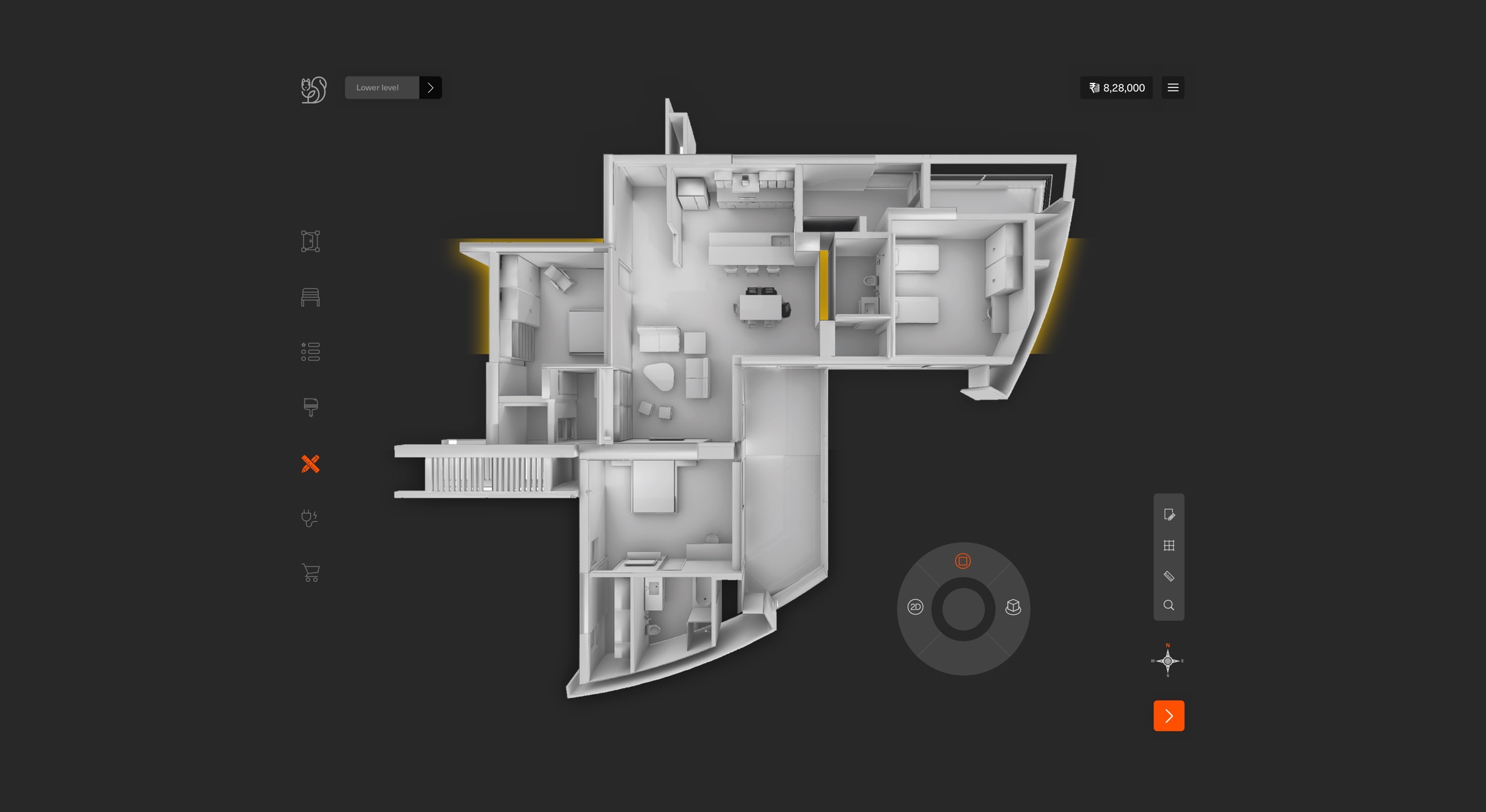
This allows customers to play with walling layouts from the plan view. The rationale here is that a layout of a space is best understood by zooming into that space, but also by never losing the context of the layout of the overall home.
This also makes it easier for the user to see impacts/compromised areas, and hence ensures that a customer is making a decision in totality (all factors considered).
There is also a provision for a layout description which will show what all a customer gets and doesn’t get as part of a layout (using icons and simple text).
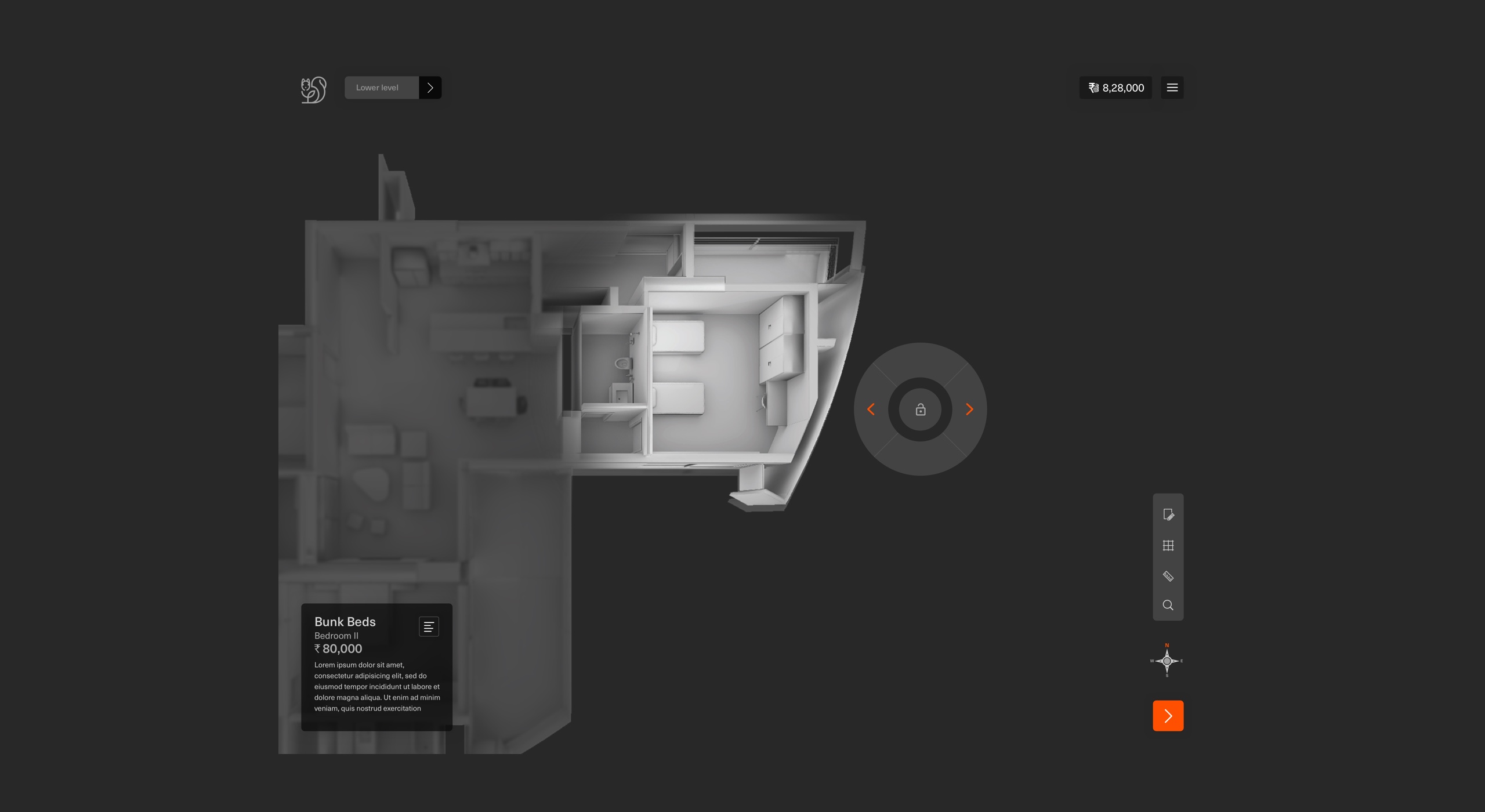
Furniture planning
The idea is to allow customers to play with furniture layouts from the plan view. Similar rationale as the walling stage.
At the furniture layout stage, a customer will be zooming into that particular room from the top, and not the space as a whole. This is because the furniture layout is best understood in the context of the room, and usually remains unaffected by other layouts of the neighbouring rooms.
This was a critical stage, as it sets the tone for Functional Planning and Electrical Layout Customisation.

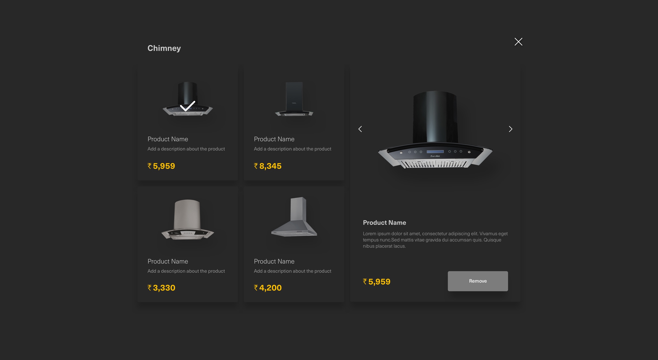
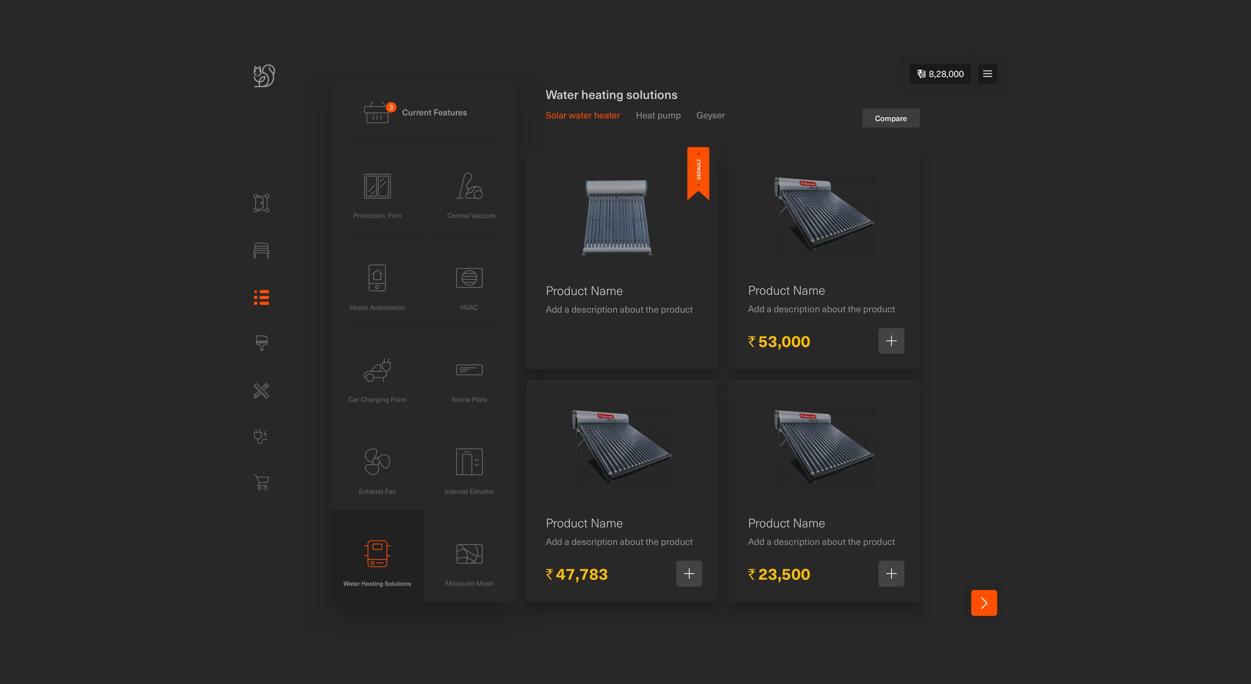
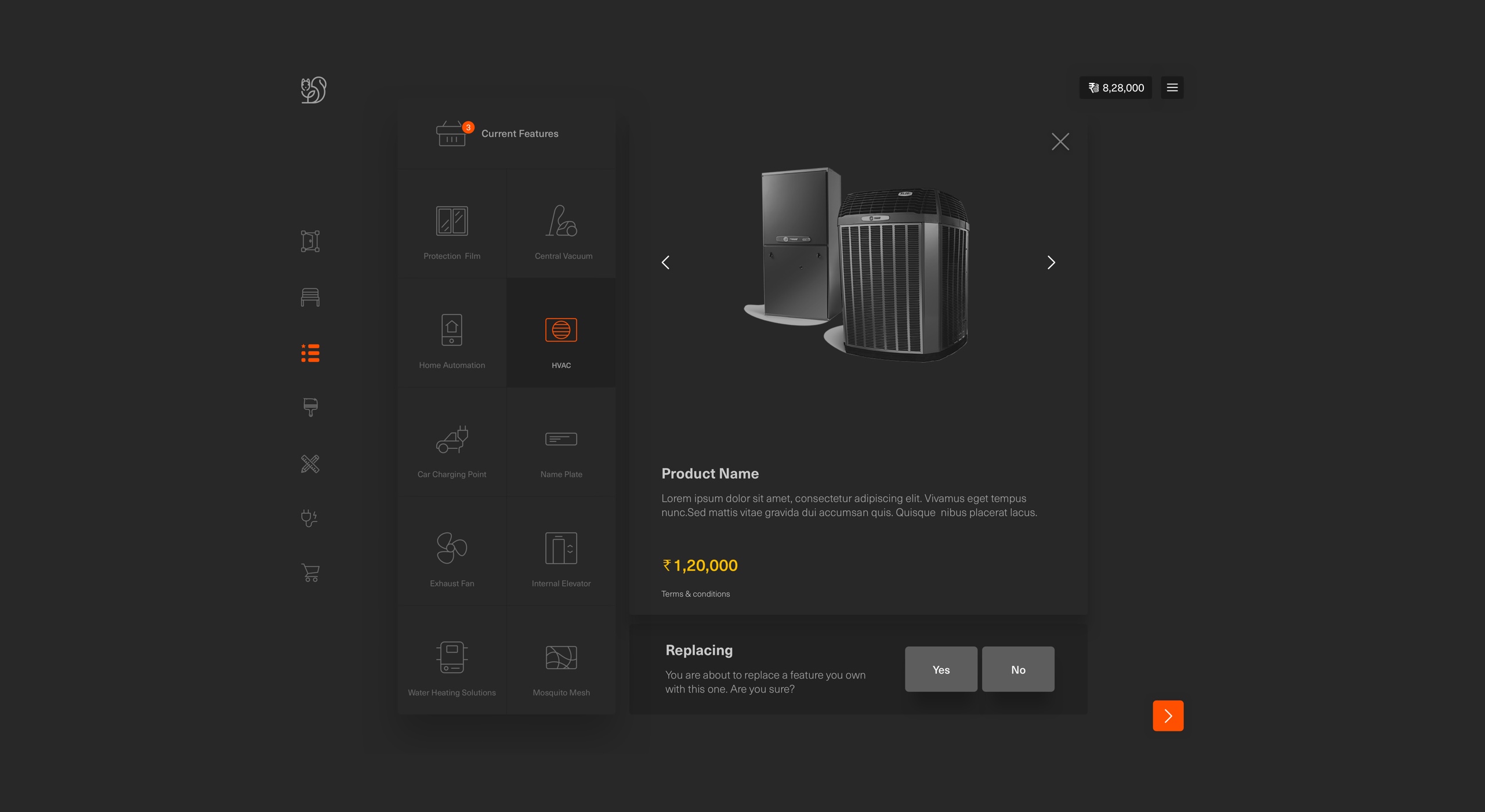
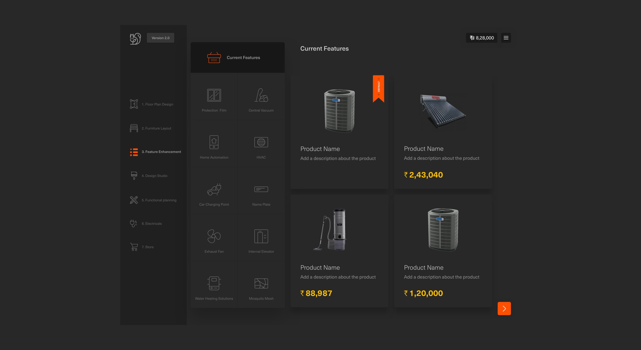
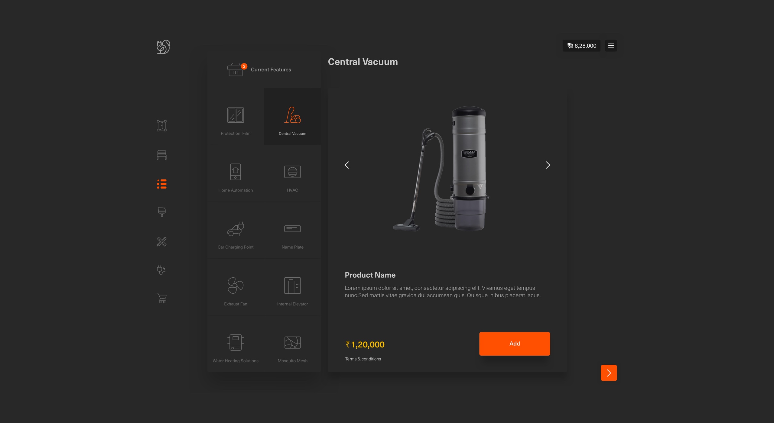
Feature enhancement
Features are big-ticket items that are best understood based on details and representational images. Hence, feature enhancement stage uses a tile-based approach to select such items instead of a 3D render.
These are global selections for the home and are not space/layout dependent. This is again because anything that is dependent on a layout should be understood in the context of that layout, and hence is up for selection in Functional planning (like Split AC).
Also, these items are categorised based on purpose first, and a customer can choose one or more items in a category based on architectural and functional constraints.
User can compare items, it also communicates about the pros and cons for each element while comparison.
Business: up-selling and cross-selling
Design studio
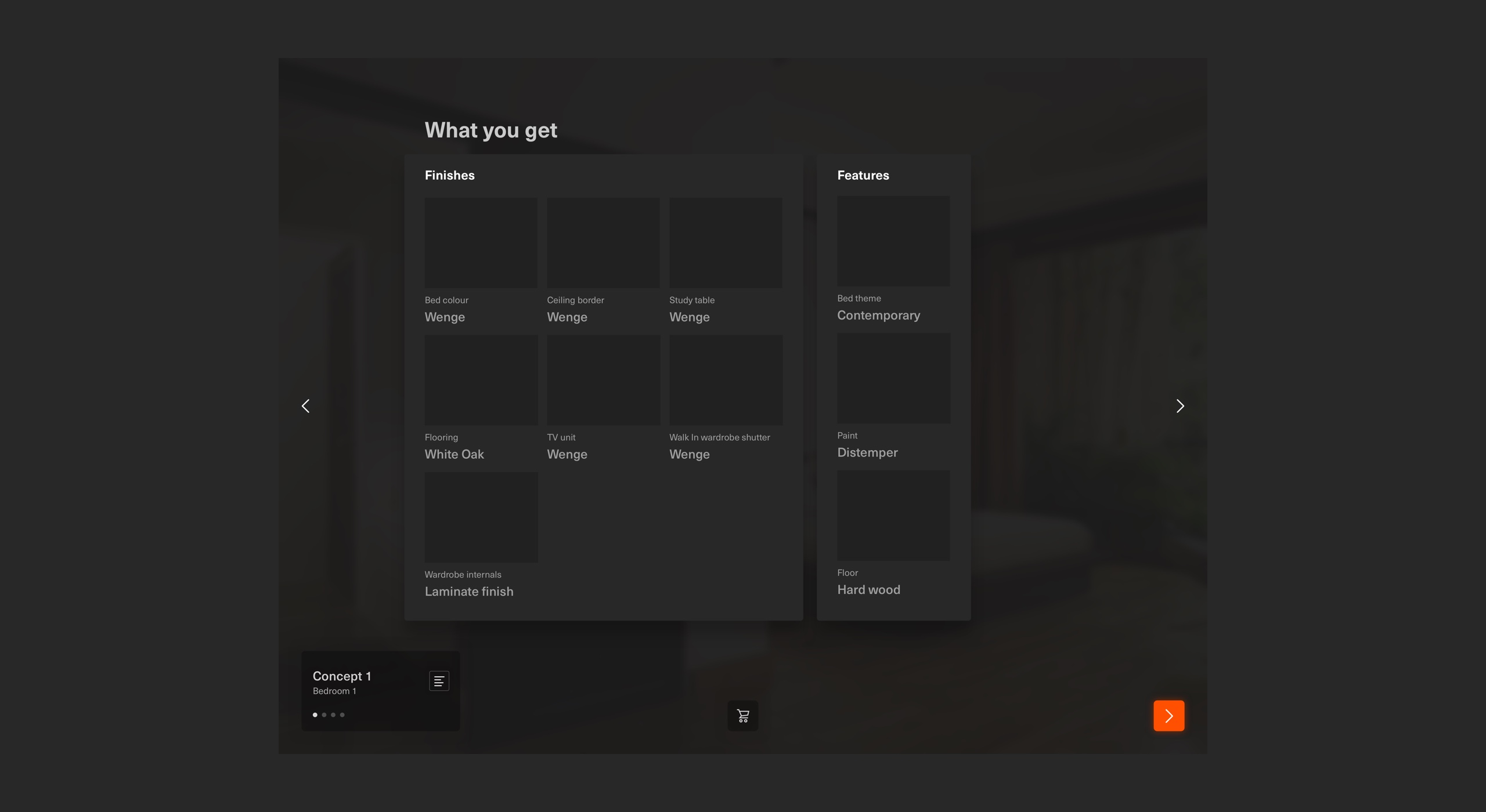
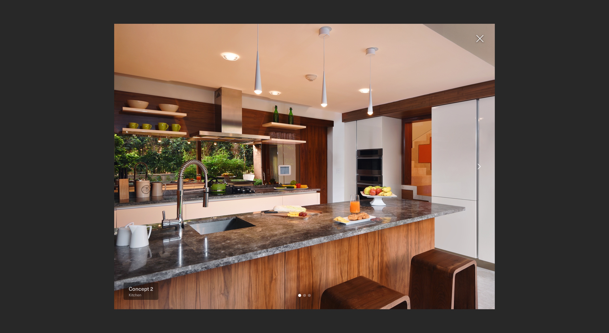
Finishes and themes, aesthetic aspects are best understood when they are looked at in a conceptual high resolution render of the space. This is the part of the application where users can connect most to TE’s design philosophy.
The design studio is the highlight of the product because it gives customers a true sense of what TE can create for them. I wanted customers to be exposed to as many concepts as possible so that they choose what they like the most before they choose functional aspects.
This also enables to upsell some of TE’s products because they look their best in the concept image. Hence, users can buy items that they see in the image when they don’t have them as part of their default home.
“Users construct mental associations via aesthetic suggestions“
Business: up-selling and cross-selling
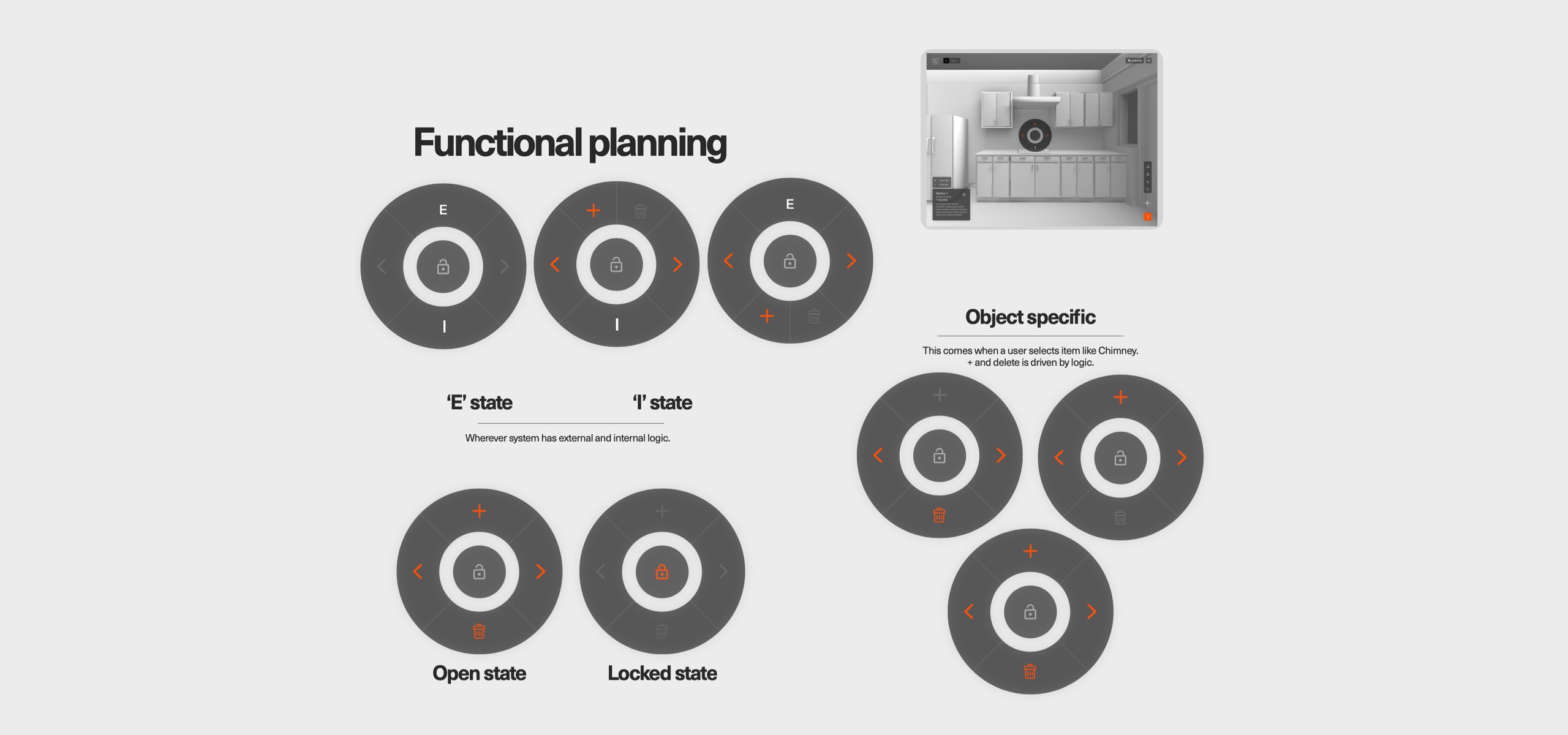
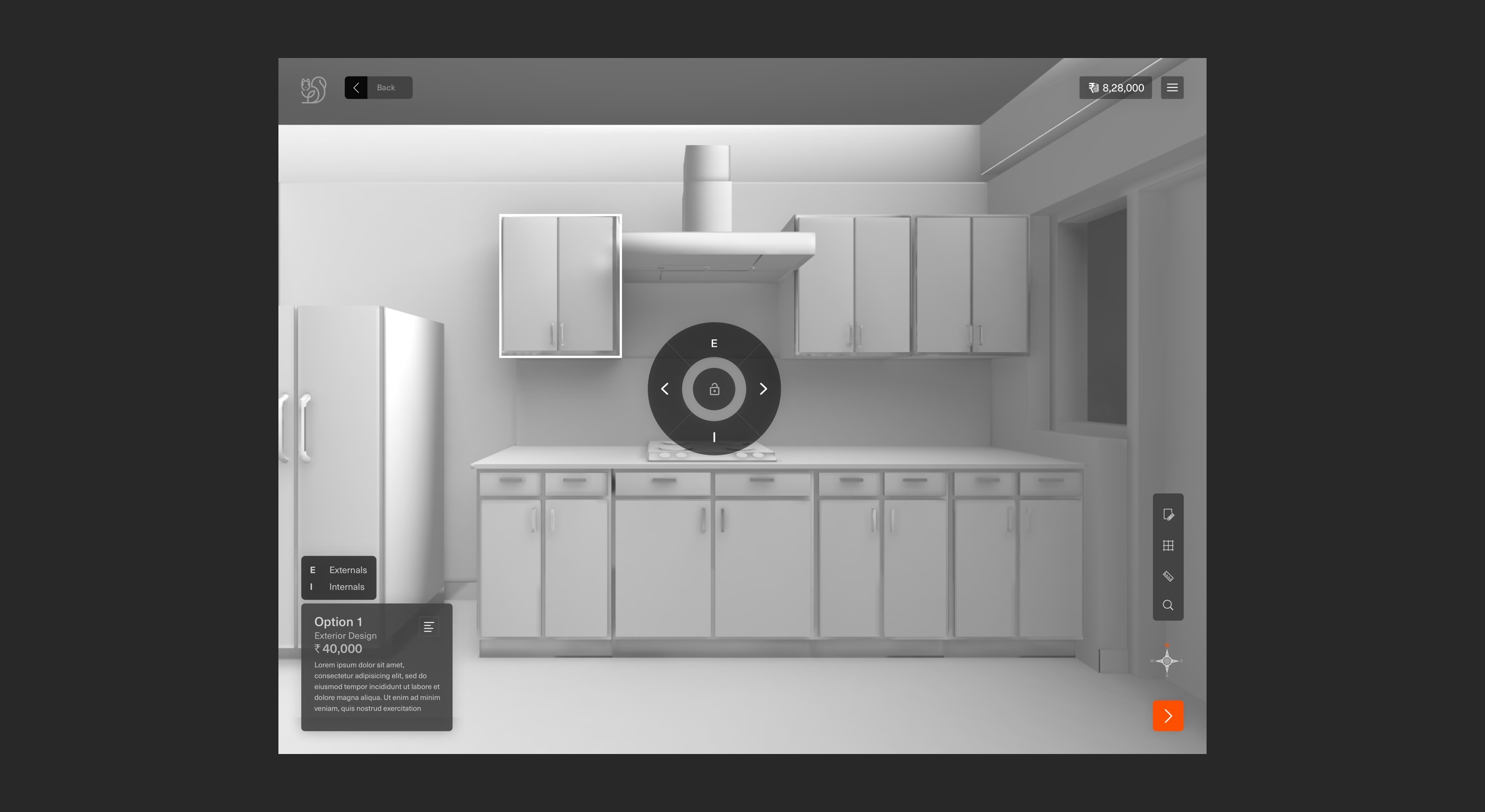
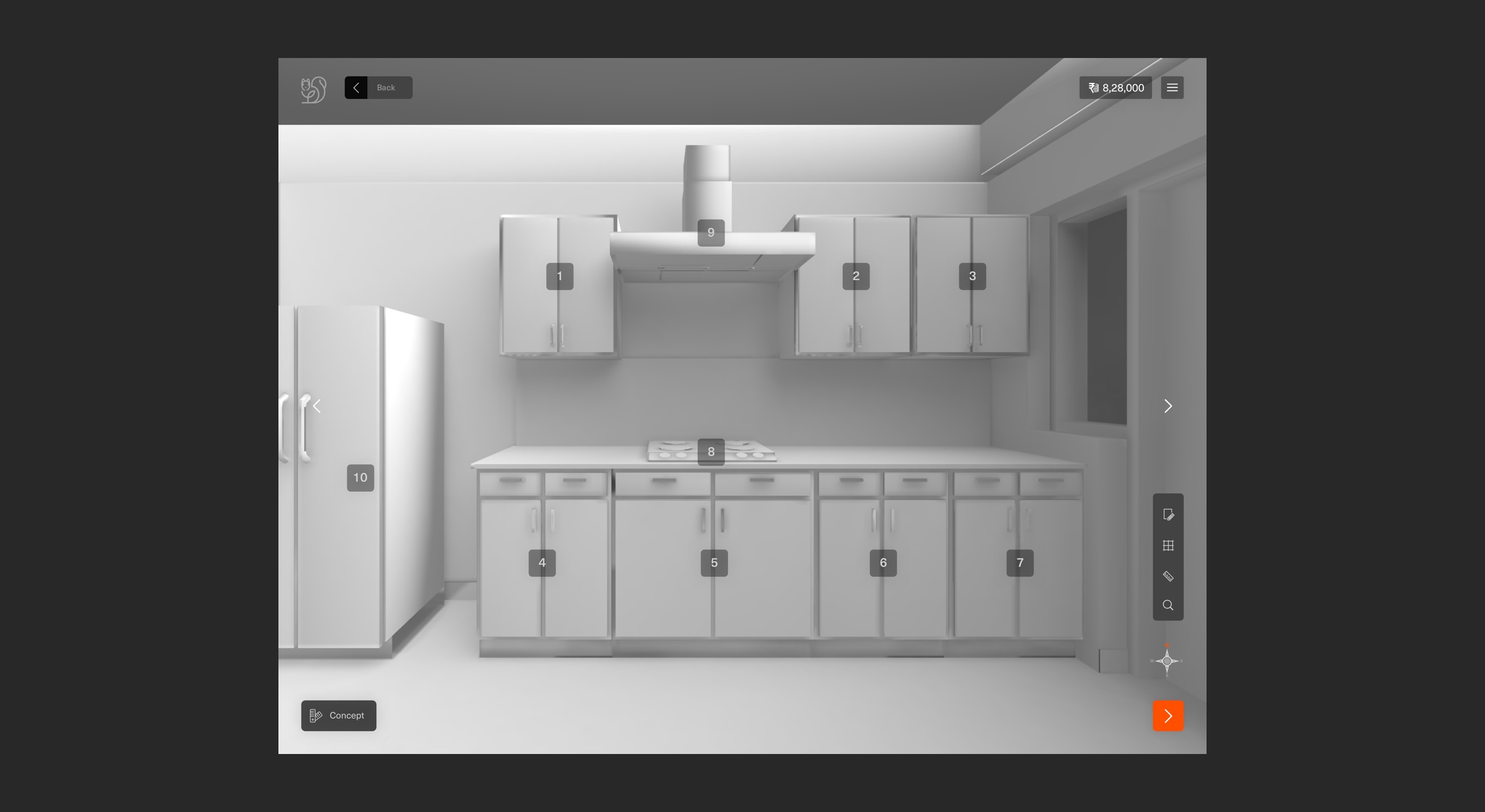
Functional planning
This stage empowers users to dabble with the functional aspects of their home (like cabinetry interiors and bed storage options).
User lands in the space and can look around. This gives them a more personal feel of the space. Items which they can customise will have an icon on it.
One of the critical findings from user research was users feel lost in space because they aren't sure where to start in space and how many items can they customise.
To solve this, I introduced numbering on items which users can customise for each frame view of a space. Numbering was mainly to give an idea to users about how many items they can customise in space because most customers don't even realise the level of customisation that TE offers, and hence they end up missing out.
A customer can toggle between options in either 3D or images depending on which option the architects decide gives the real feel of functional aspects.
Business: up-selling and cross-selling

Personalise electrical
connections -electrical layout
The idea was that users could customise their electrical layout from the top view. This stage was intended to help them understand the layout, and make changes as needed, and hence, the design helps them see all points and connections in one shot.
This stage is not intended to be a place to make functional or aesthetic selections like light points or light fixtures that look best in that room or serve the best purpose in that room.
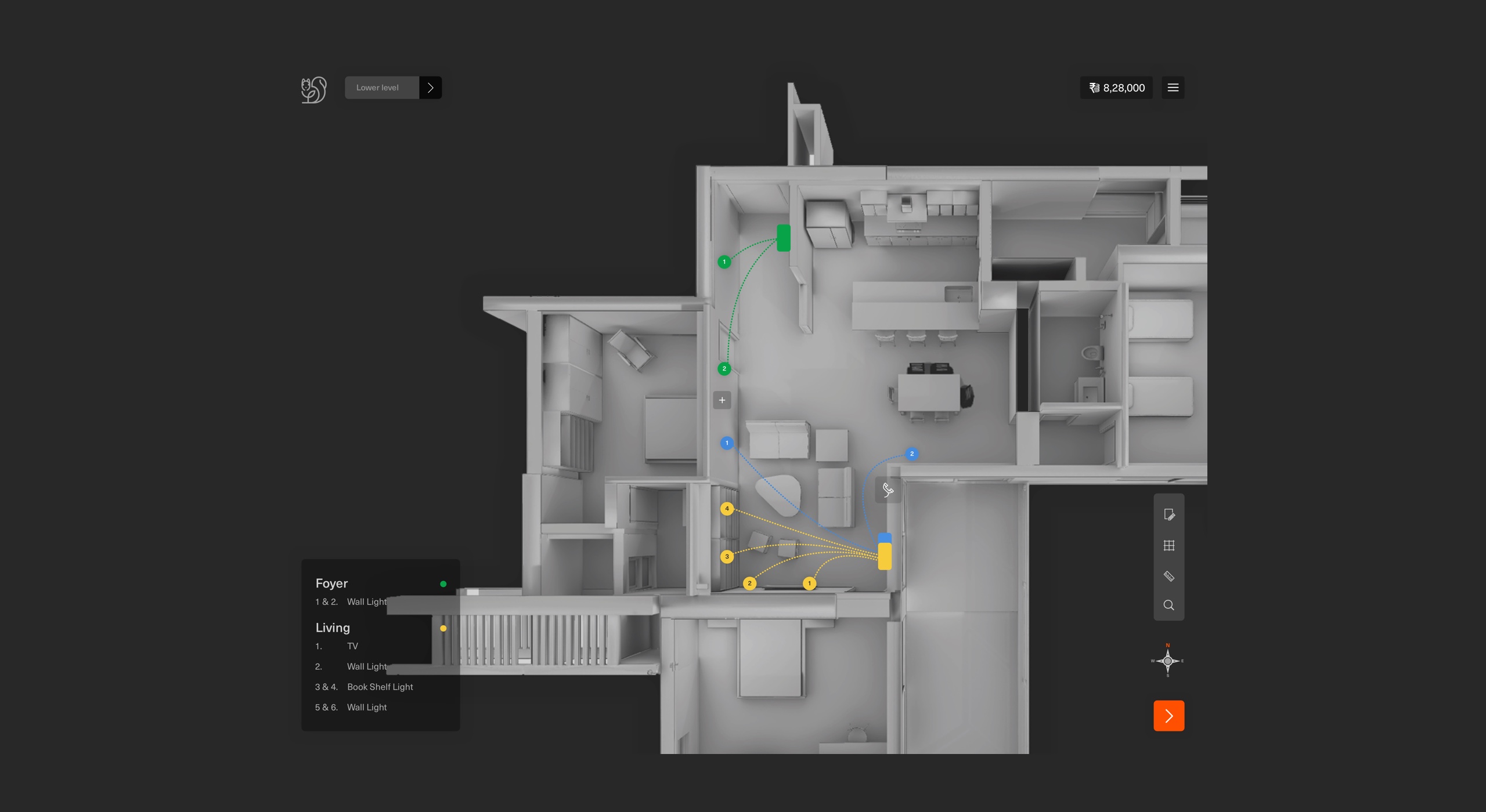
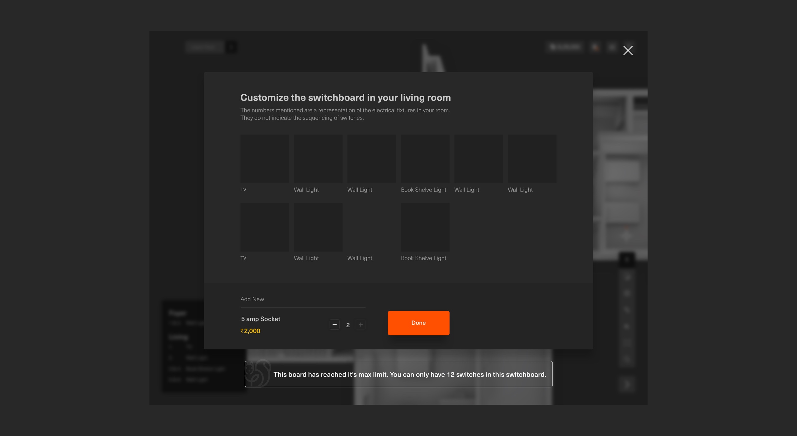
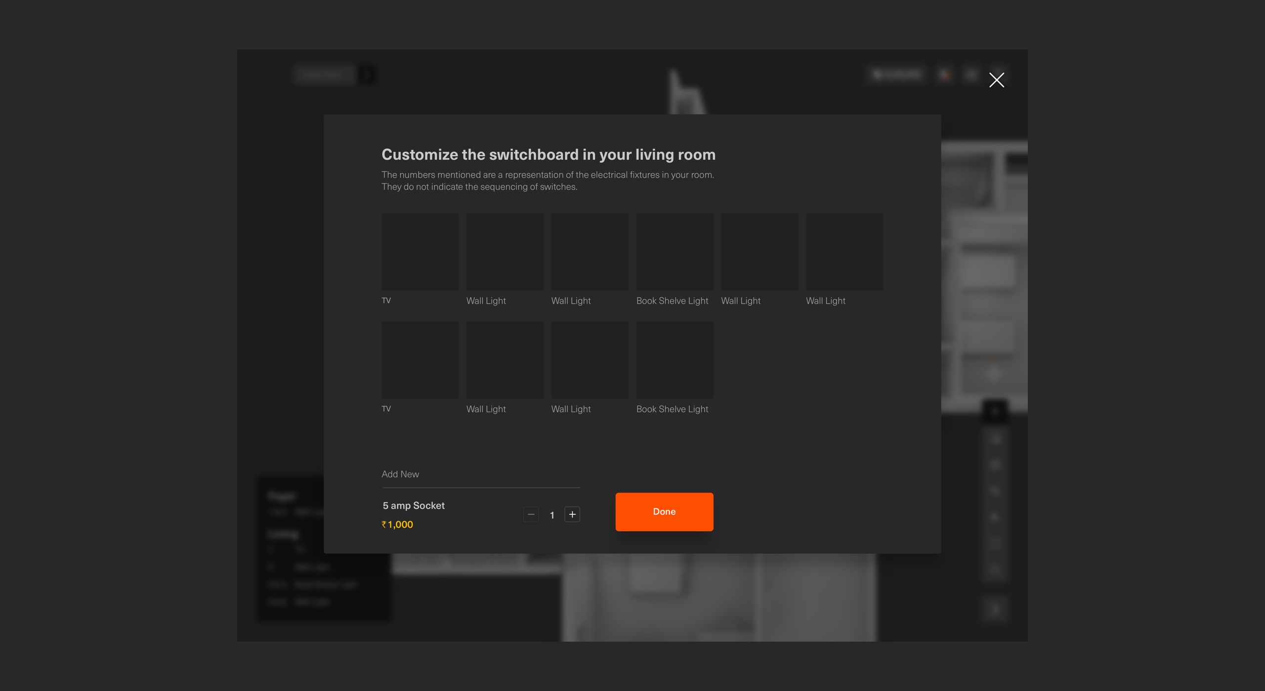
Interaction - electrical layout
Store
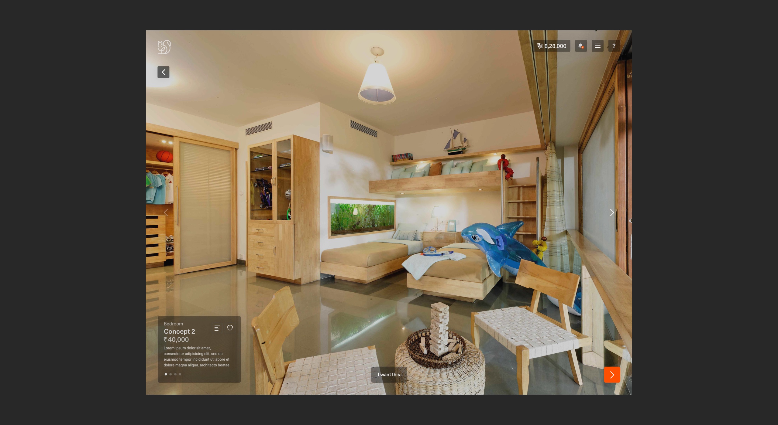
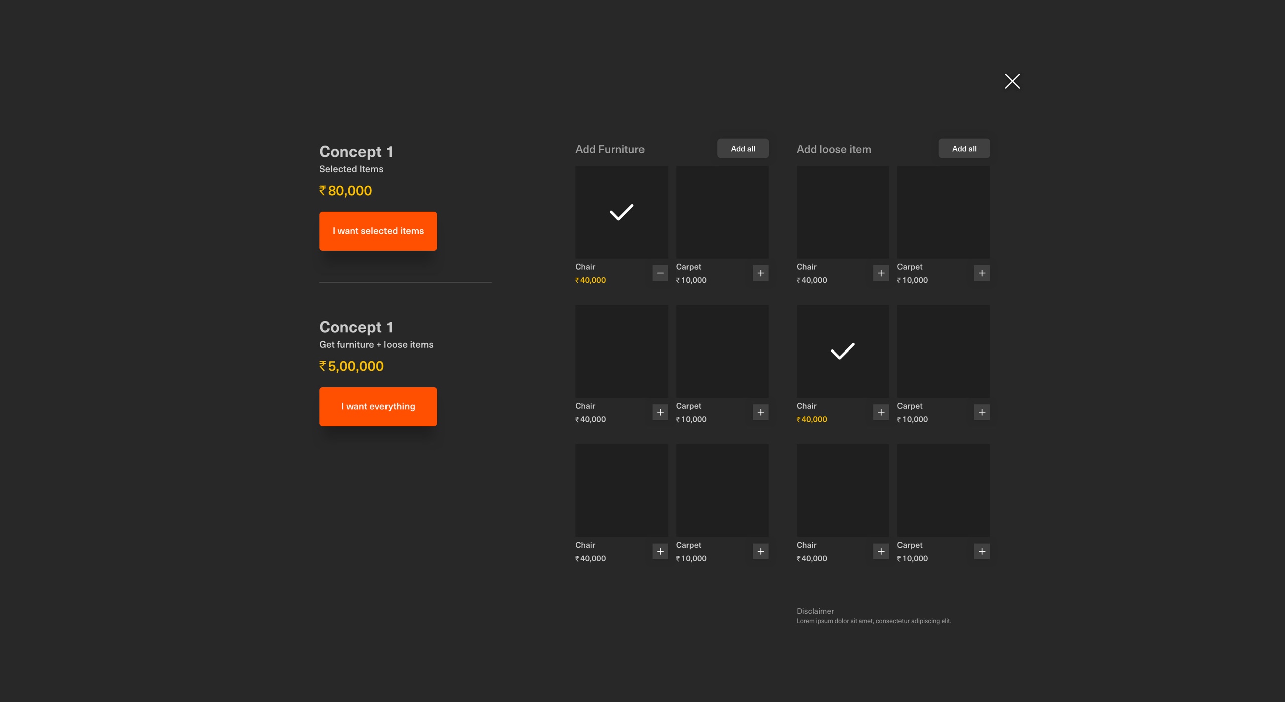
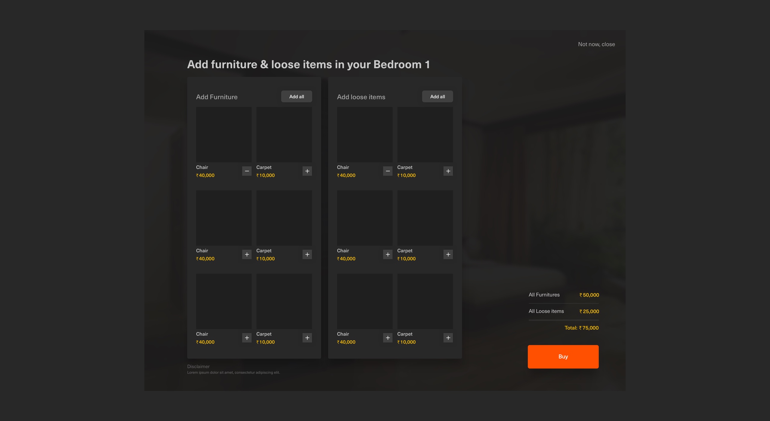
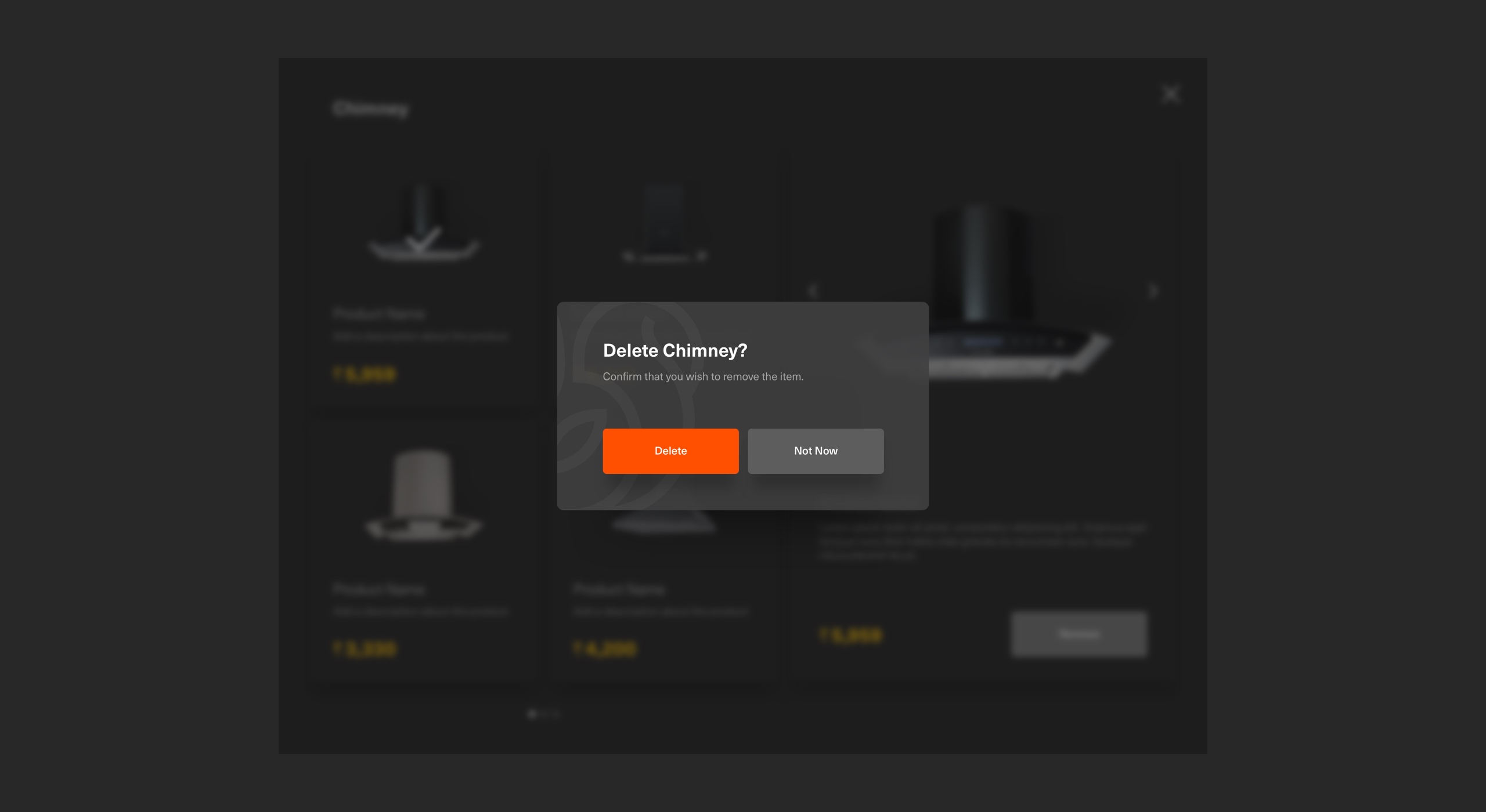
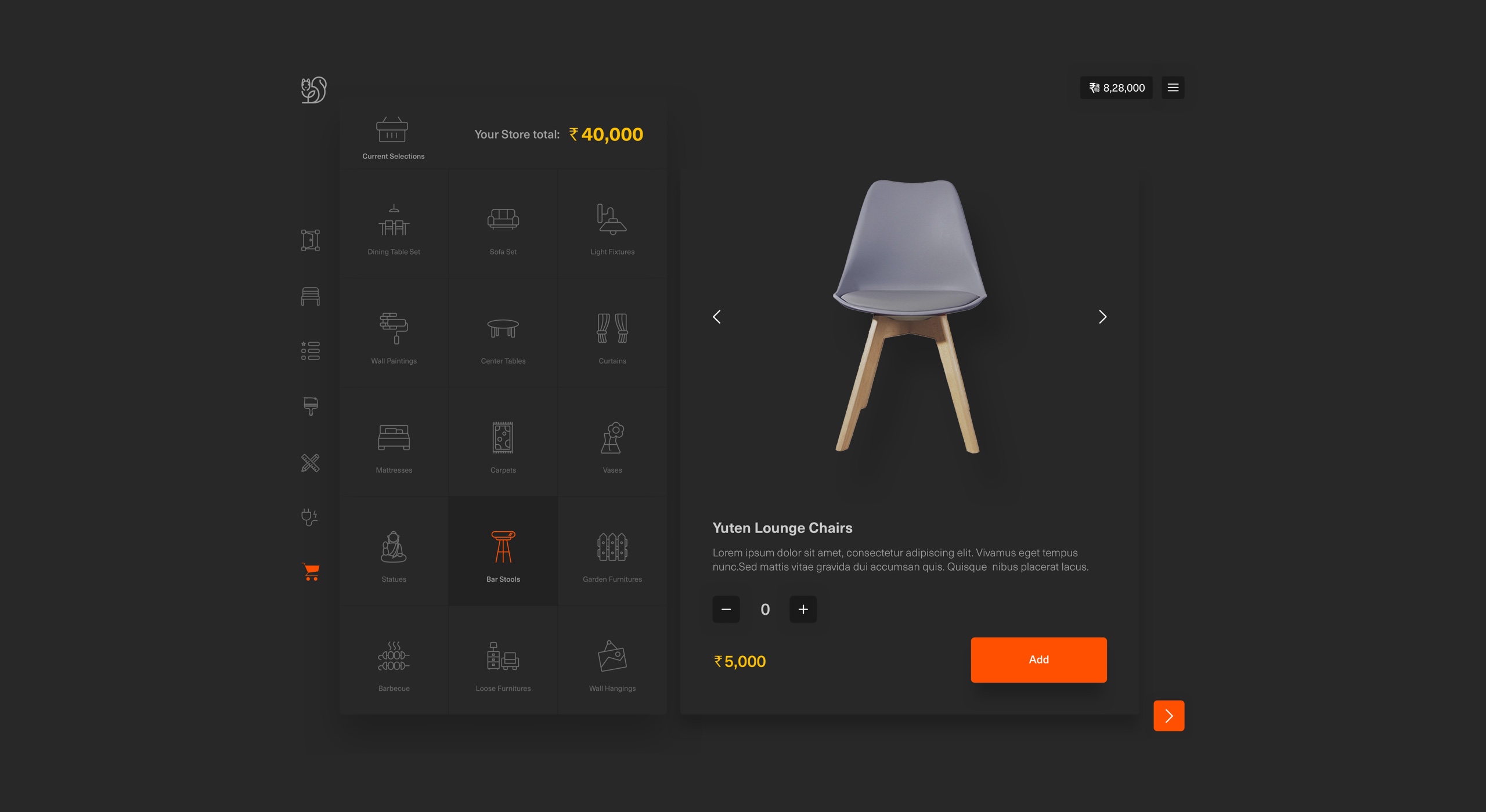
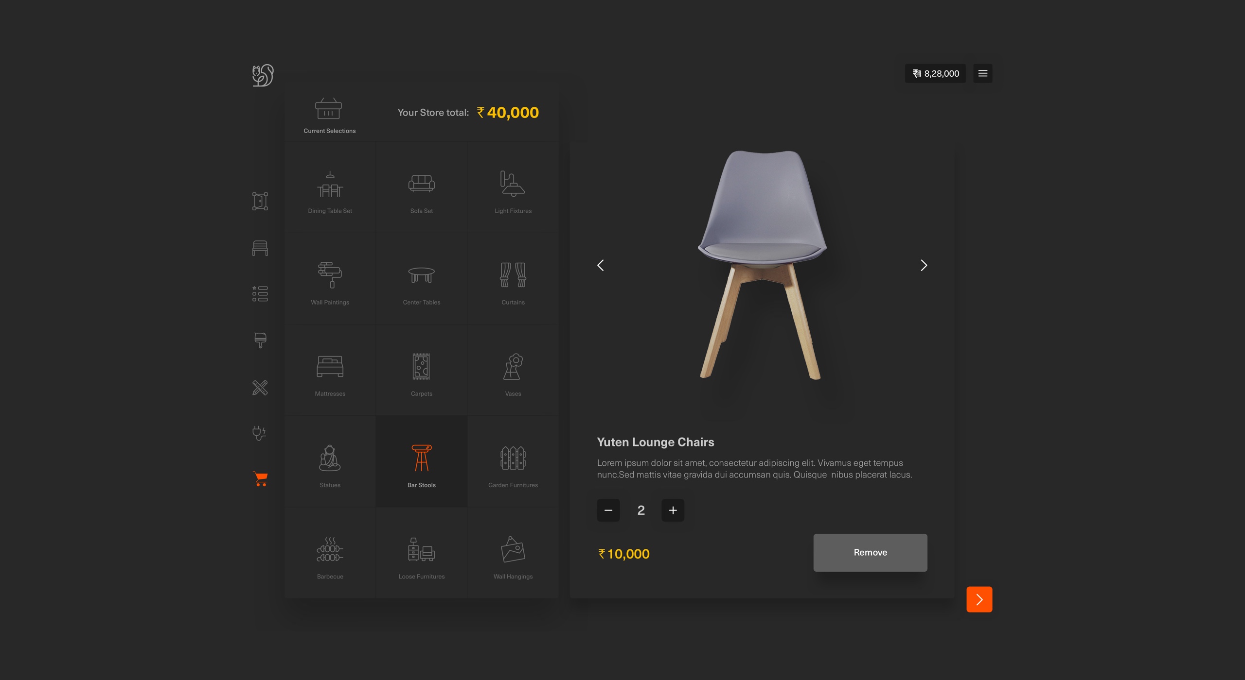
A store is a one-stop-shop where customers can choose loose items, e.g. loose furniture, extra lightings, furnishings, curtains, plants etc. that they’d like to buy from TE.
These aren’t layout dependent because TE has no control over where the customer would choose to place such items once they’ve bought them.
Users: loose items Business: cross-selling
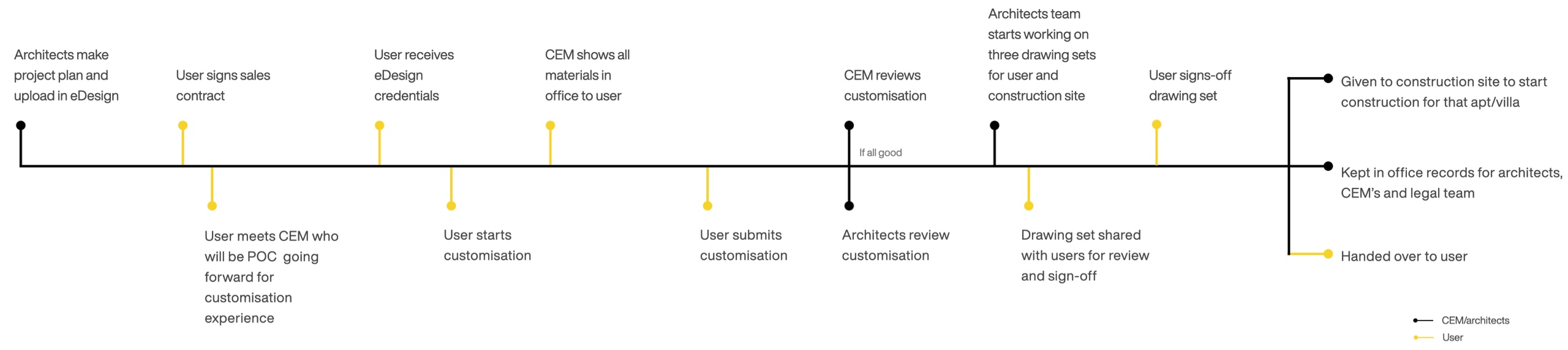
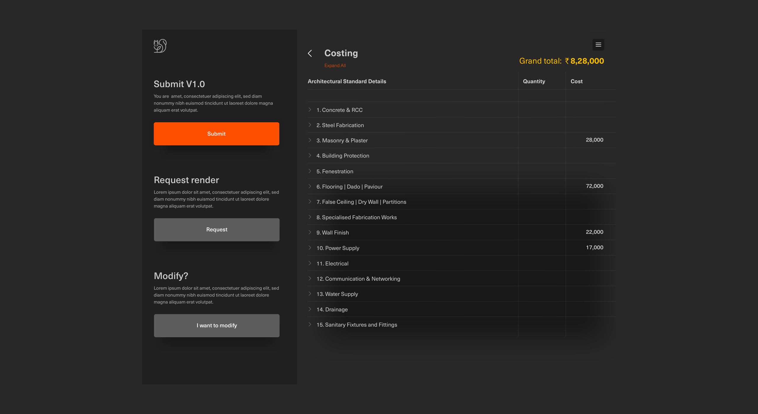
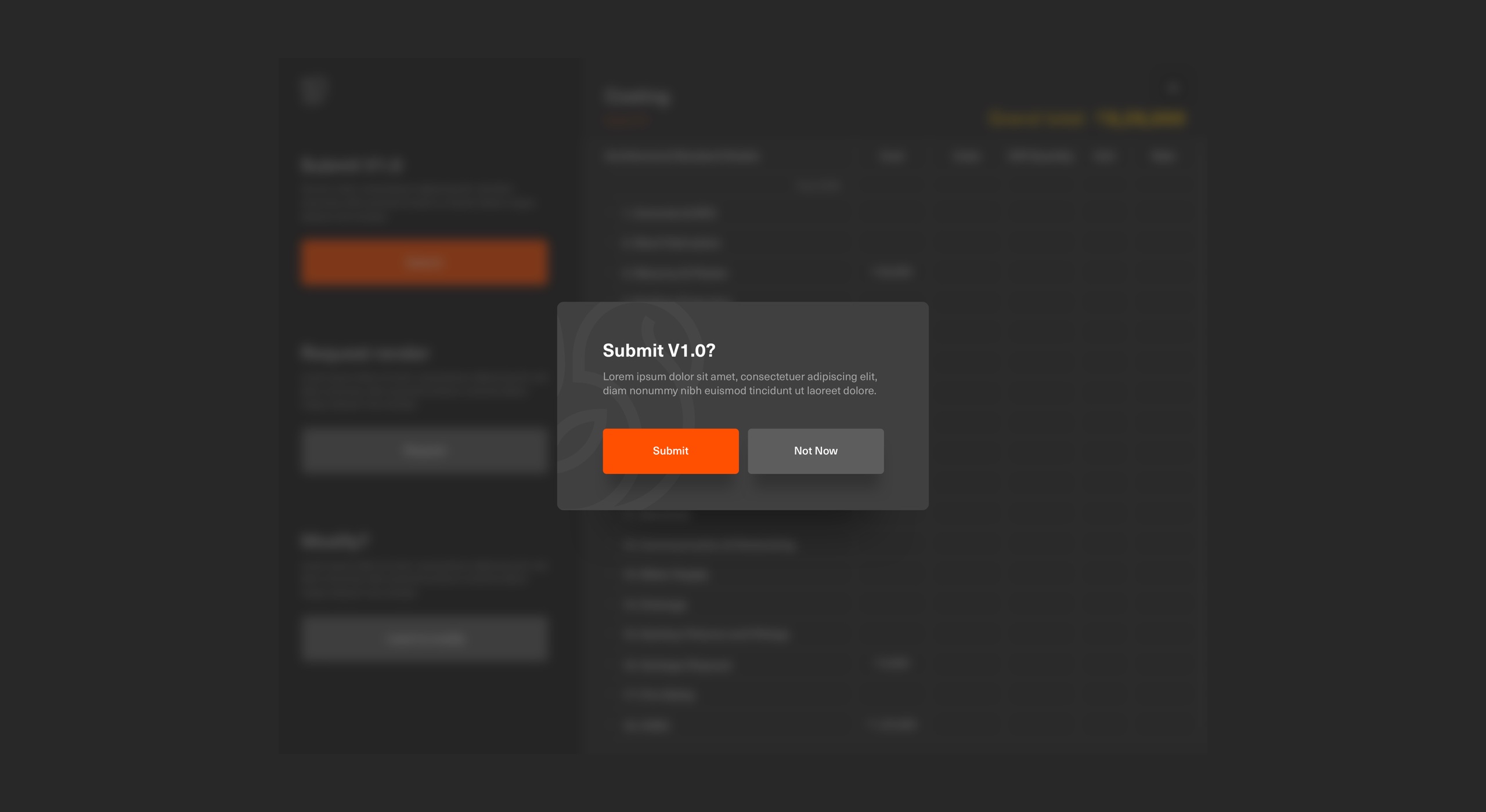
Submit - finalised version
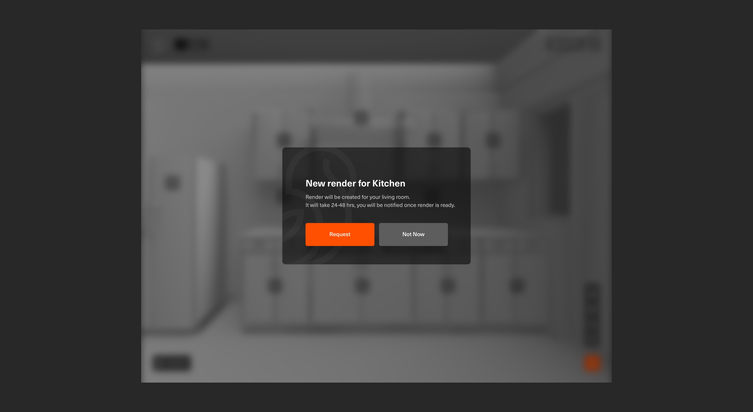
Once the user is done with the customisation they can review, modify, or request for the high quality renders, which will show users how each space will look like. Renders will have all 7 stages of customisation.
Before the user submits the finalised version, they see a detailed bill of quantity (BOQ) along with the complete price breakup.
Once users submit finalised version system gets locked, and users will not be able to make any changes in that version.
The finalised version goes to the CEM's and architect's systems for review.
Submit (on-click) - there are 3 sets of final drawing set gets generated (pdf).
- Set 1 is for users to review and signoff digital. Once its signoff TE prints them and ships it to the users.
- Set 2 is for architects and CEM's to review once its good to go it goes into TE's documents department.
- Set 3 goes to the construction site.
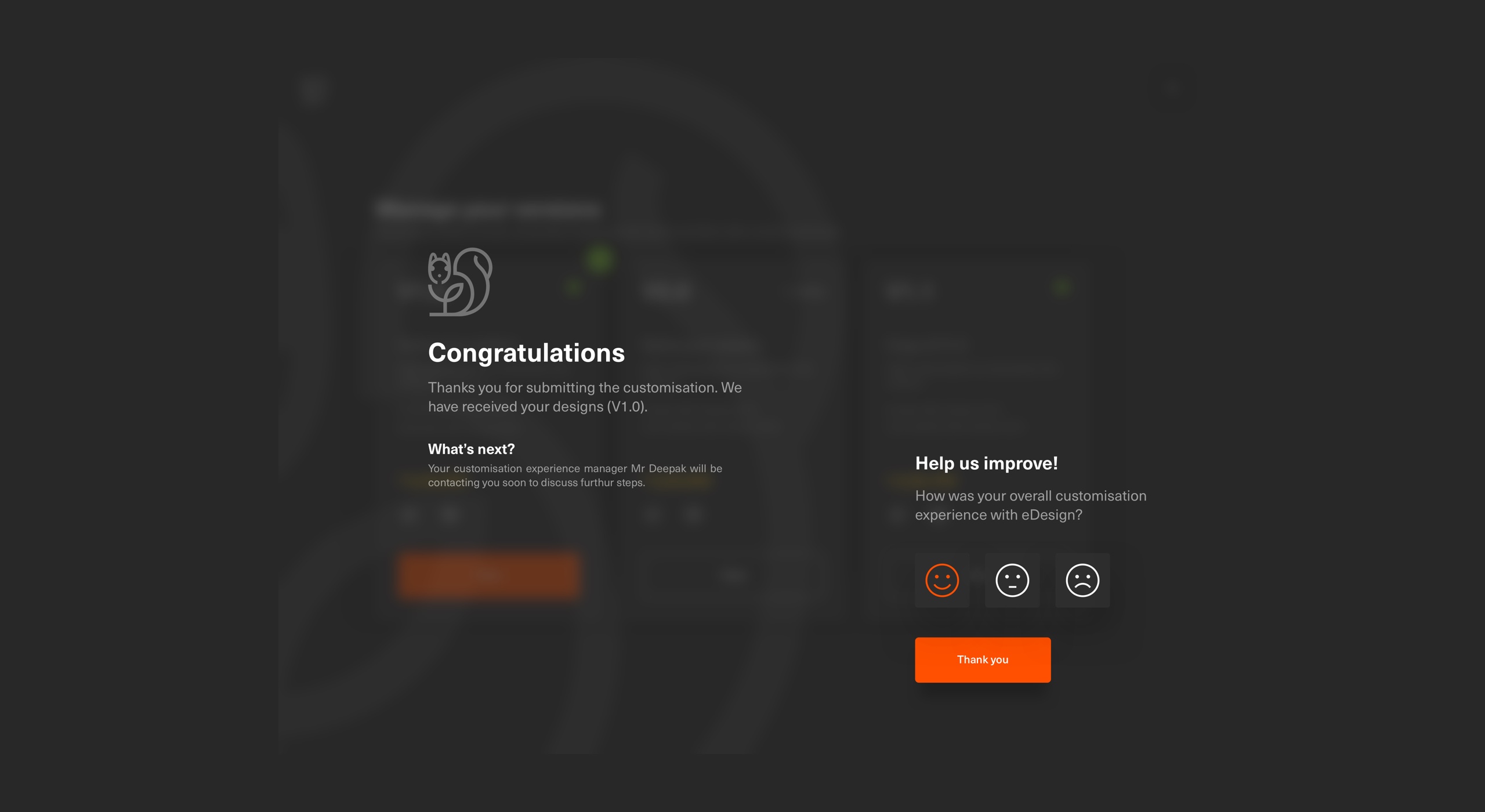

Measure - satisfaction metrics
Product owners decided to use Customer Satisfaction Score (CSAT) metrics because of its simplicity, as this is one of the most common metrics for gauging customer satisfaction. It's also one of the most straight forward.
Visual communication
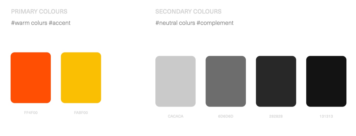
Color palette
We decided to use warm colours as primary because we want to build a visual language which communicates to the user when they see the screen.
#FF4F00
For all primary states. It guides users where they are and what’s next for them.
#FABF00
Used this colour only to communicate cost. The direction was to get users attention on the cost throughout the application.
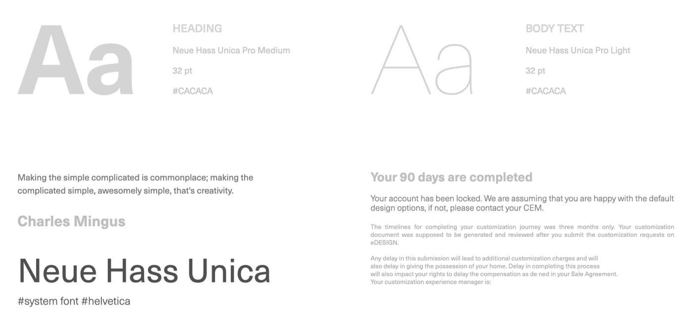
Typography
The client wanted to go for the customised font but considering time and cost, they decided to use something readily available.
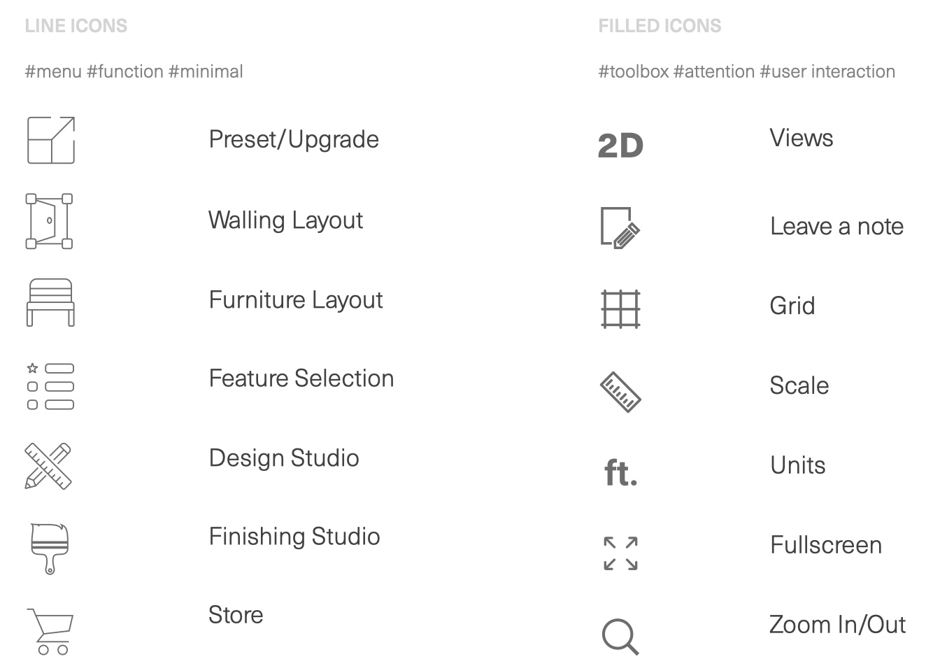
Iconography
Minimal line-based icons which we tested with users/marketing/CEM’s to align with brand.
Share. Learnings and challenges___
Every project teaches us something. It's important to observe and act at the time before things go out of hand. Sharing a few from this project.
Testing strategy
Since TE's majority of the users are the people who hold the highest social status, so it was quite hard to get their time. Most of the time, I used to rely on sales or CEM's. I used to go to the sales office and wait for people to turn up or wait for CEM's meetings with users. This is a challenge as when I need to test with users I don't have them. If I wait, I lose time as the tech was happening parallelly.
I found another way to do quick test contents/designs. I took the guerrilla testing approach started showing designs to others to get a fresh perspective. Is it easy enough for first-timers?
Early adopters testing - I named them because they were seeing/using this product the first time.
- Sales office (at the site) visit and tested features and concepts with prospective buyers.
- CEM meetings with homeowners who are already TE customers but using old eDesign.
- Office colleagues who were not part of the project
- My few friends who bought a house somewhere else.
- My family, especially my daughter (10 years)
Testing with stakeholders
- Sales and marketing team
- Customisation experience managers (CEM)
- Architects
First design showcase
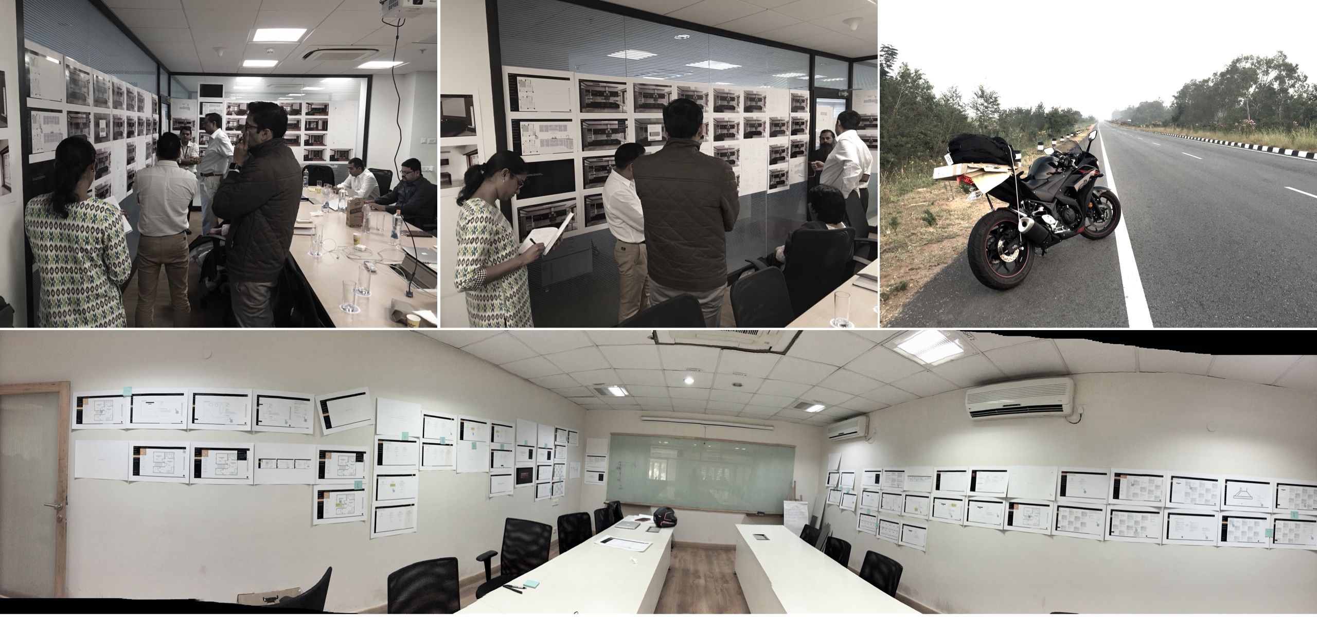
During my first design showcase, I showed wireframes on the projector, and soon I realised that stakeholders had a hard time understanding the flow and designs. Especially connections because for few people on-screen it's hard to connect the dots between screens. I observed how architects worked and realised, architects generally play a lot with papers (A3) when they work on designs and when they present. I took that as a learning and changed the way of showing flows and designs.
I moved from digital to paper for design showcases so that architects can feel homely.
Visual designs I showed only on iPad because I observed that the projector doesn't justify the quality/perfection and also I wanted to give them the real feel how the product is going to look and work on iPad.
Fun fact \ (•◡•) /
For design showcases, I used to ride 580kms with a box of printed wireframes on A3 sheets to showcase. I named that box 'Box of hope'. Yes, I love riding a motorcycle, so I thought, let's mix fun with work.
Design communication
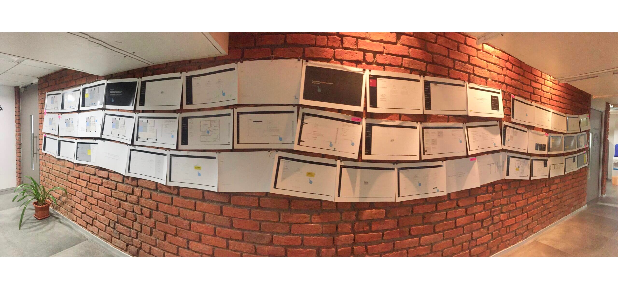
Communicating designs in detail sometimes is challenging for the other teams. I used to share files and realised that people hardly used to go through in detail. So ignorer to solve that I posted all designs based on scenarios and flows on the wall in the team area so that everyone can go through.
Design governance
- Manage design scope
- Manage and run design showcases
- Design team retros
- Design team stand-ups
"Designs were in sight all the time."
OO. Post live ___
It’s hard to quantify how much I did learn by working on this project with such a talented team, but I can easily point out how the redesign impacted users and how it reflected in business. After eight months of going live, Total Environment shared data with us to celebrate success.
eDesign
- Fastest customisation was in just three days by a user with 22% customisation
- Customisation cycle reduced from 60-90 days to 7 - 23 days. (based on 138 users)
- 94% jump in self-start
- 38% sales increase in movable furniture and furnishings
- Drawings sign-off time was reduced to 89%
- 19% jump in updates and preset sales
CEM's
- Number of calls from customers dropped by 76%
- Faster turn around time for personal requests
- Exceptions reduced by 42%
Architects
- 3800 apartments project was uploaded in just four days
- 17% increase in design options
Phew!
That's a lot to take in. Just not to add more length to this case study, I have skipped a few aspects of this project here like: How I sold the design to clients, I didn't show wireframes, how we increased operational efficiency to name few.
If you need any more information, please send a message, and I'll be in touch as soon as I can.
Good design is about making a connection."
Total Environment founder